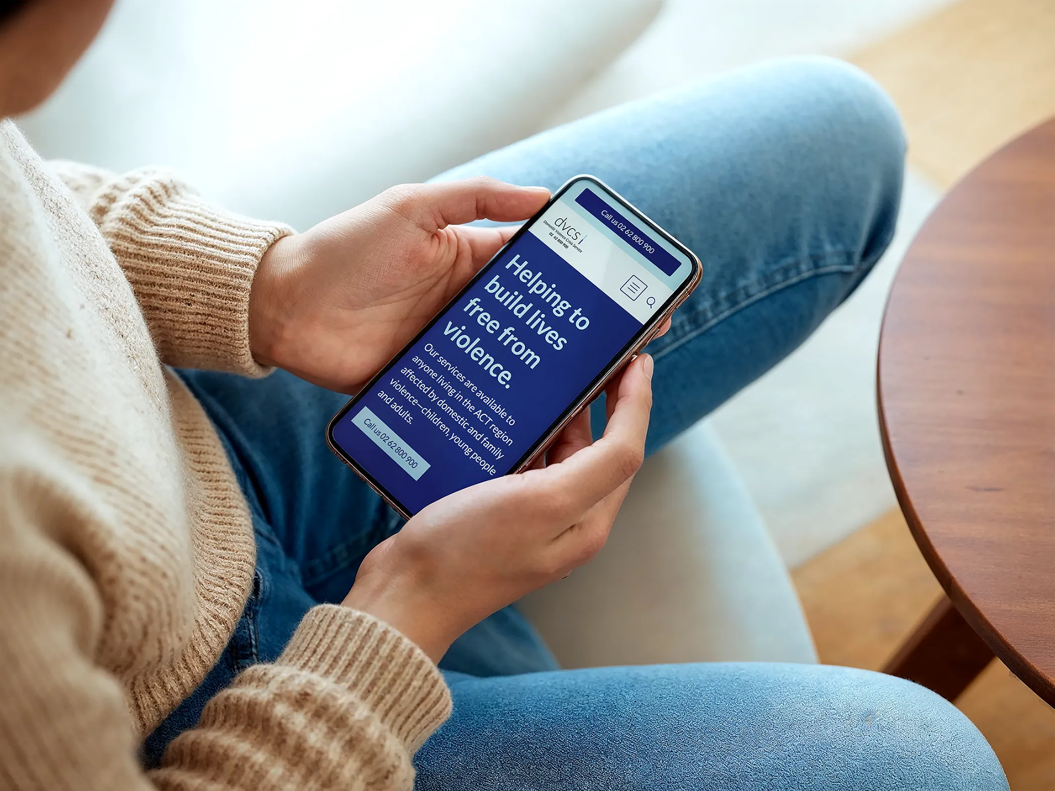
Whether someone's searching for an appointment, looking for resources, or trying to understand their options, they need a site that doesn't get in the way. Clear navigation, plain language, and an easy path to what they need. That's what I build.
Your visitors aren't browsing casually. They might be anxious, looking for answers to something personal, or trying to find a service or resource that can help them. They need a site that works: clear navigation, readable content, and the most important information easy to find.
Meanwhile, you're managing complex health content, privacy obligations, multiple audiences (visitors, referrers, supporters, practitioners), and often a website that's been patched together over years without a design hand.
If you need to attract funders or referrers, or build community trust, your brand has to do that work too. A site that looks clinical and dated can undermine confidence before someone has even engaged with your content.
Health information is among the most sensitive data there is. But privacy isn't the only thing that needs careful thought.
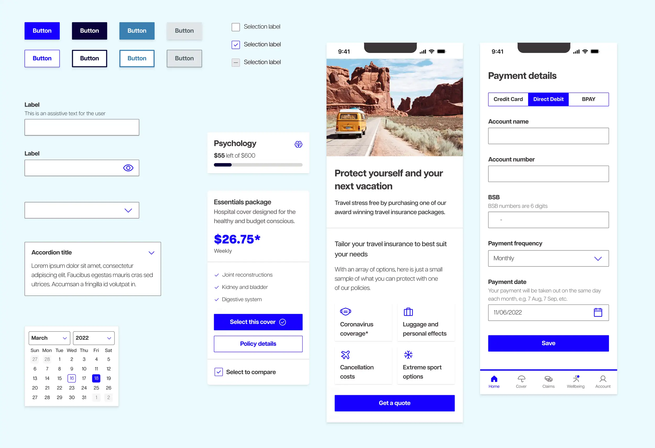
Some of what this looks like in practice:
Every health project starts with the same questions. What does someone need to find in the first thirty seconds? How easy is it to get in touch, find a resource, or take the next step? Are the most important pages actually findable, or buried under three levels of navigation?
Next comes accessibility, built for real people: visitors who are older, have lower digital literacy, or are navigating the site under stress, not just ticking compliance boxes. And then the visual design: warm and trustworthy, not clinical or corporate.
For larger organisations, there's often a design system conversation too. Bringing consistency and accessibility across every touchpoint, not just the public-facing website, is something I've done at scale with health clients. If that's where you are, it's worth talking about.
I also work with a trusted network of professionals including copywriters and photographers who understand health communication. They know what responsible health communication looks like in words and images, what to avoid, and how to get it right. If your project needs that kind of support, I can bring them in.
Hi, I'm Shannon, your Inclusive Design Partner who is on a mission to make beautiful websites that work for everyone
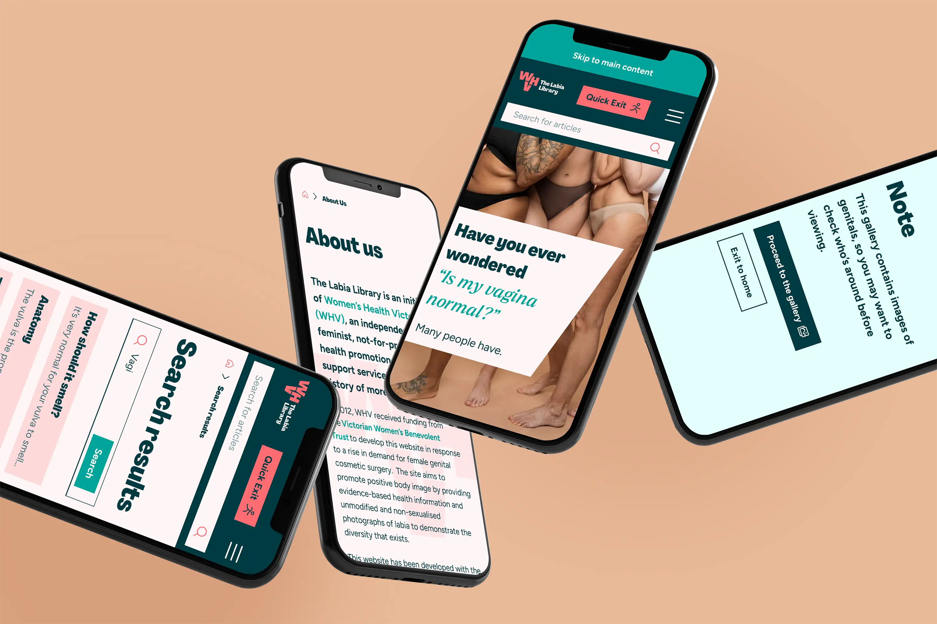
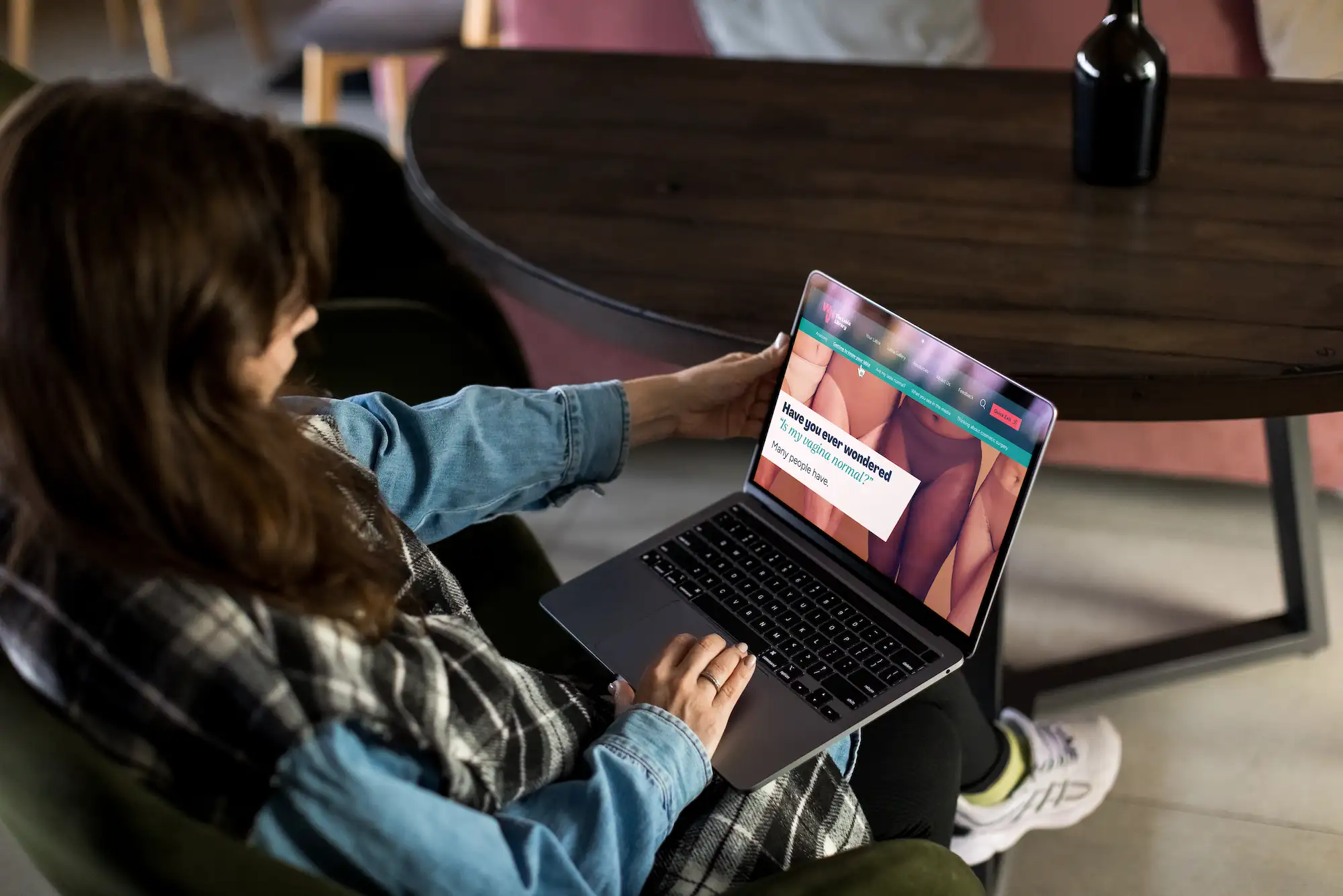
My design career spans more than a decade, including work with health organisations such as The Labia Library and a major Australian private health insurer, where I worked on a design system used across their organisation.
I've also helped organisations regain control of their sites after difficult situations with prior developers. Everything I build is yours to own, update, and grow with.
If you're looking for someone who understands health communication and won't treat your project like any other website, we should talk 💙
Your visitors aren't browsing casually. They might be anxious, looking for answers to something personal, or trying to find a service or resource that can help them. They need a site that works: clear navigation, readable content, and the most important information easy to find.
Meanwhile, you're managing complex health content, privacy obligations, multiple audiences (visitors, referrers, supporters, practitioners), and often a website that's been patched together over years without a design hand.
If you need to attract funders or referrers, or build community trust, your brand has to do that work too. A site that looks clinical and dated can undermine confidence before someone has even engaged with your content.
Your website should make that trust feel deserved. Let's talk 💙