A design system built for consistency, accessibility, and scale across every digital touchpoint of one of Australia's largest private health insurers.
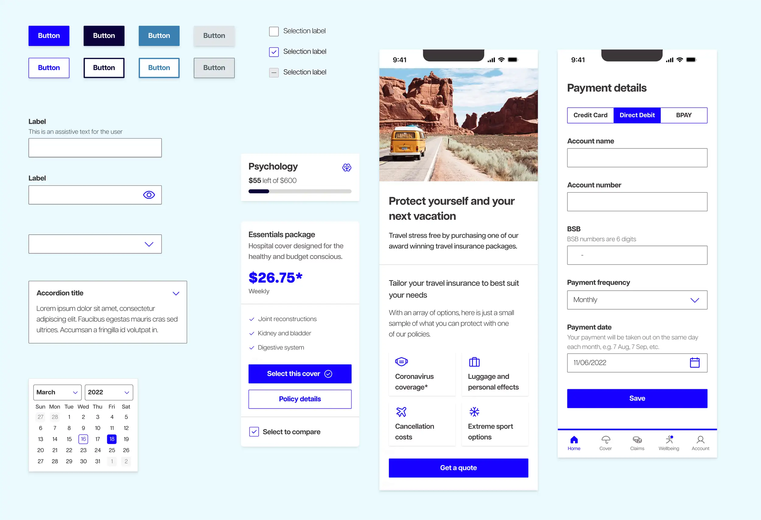
I led this project during my time as a Lead Designer at Wongdoody, working directly with one of Australia's largest private health insurers. The insurer had a design system of sorts, built in Sketch, but it was inaccessible to the wider team and largely unknown. My audit uncovered close to 20 different button styles in use across their digital products alone.
What needed to be built:
The brief was to bring order to a fragmented digital ecosystem and make the result accessible, consistent, and actually usable by designers and developers day to day.
I opened the project with workshops across design, marketing, and development to understand what each team needed and align on a shared direction. Ongoing progress meetings then focused on specific areas including colours, typography, illustration use, and individual components like buttons, so decisions were made collaboratively and no team was caught off guard.
I built the system entirely in Figma with a full token structure, reusable components, and governance documentation covering how the system should be used and extended. Components were designed to flex across all five platforms the insurer operated.
Accessibility was built in rather than bolted on. The previous standard text size sat between 12 and 14px, a real problem for an audience that skews older or may be managing vision impairment. I set a new typography scale as a system default. I audited the full colour palette and adjusted it for contrast compliance, with approved accessible combinations documented clearly so designers could make confident choices without re-testing every time. Getting these changes through required careful stakeholder engagement and thorough documentation of the rationale, particularly with the marketing team who were protective of the brand.
Accessibility was a design requirement, not an afterthought. The insurer's audience includes people who are older, managing chronic conditions, or experiencing vision impairment, exactly the people who most need to find health information quickly and without friction.
I addressed text sizing first. The previous 12 to 14px standard fell below best practice for this audience, and a new typography scale became a non-negotiable part of the system. I audited the full colour palette for contrast compliance and documented approved colour combinations so the team could work with confidence. Component states including focus, hover, error, and disabled were designed to be visually distinct and keyboard accessible, supporting every user navigating complex insurance content regardless of how they access it.
Within the design team, the system removed a significant amount of day-to-day friction. Designers were no longer choosing between conflicting approaches or rebuilding components from scratch. New team members could get up to speed and start contributing to live features faster than before. For the broader organisation, it meant a consistent experience across every digital touchpoint and a system built to grow with the business.
A good design system does more than keep things consistent. It gives your team confidence and cuts the time spent making the same decisions twice. If you're working in healthcare or any sector where accessibility is non-negotiable, let's build something that works for your team and the people they serve.