A campaign brand, website, and poster series raising awareness of tech-based coercive control in rural and regional Victoria.
Stop Tech Abuse is a campaign by Gippsland Women's Health, funded by the eSafety Commissioner, to raise awareness of tech-based coercive control across rural and regional Victoria. The campaign focuses on the ways some partners use technology to monitor, track, isolate, and financially control, and gives communities the language and resources to recognise it and respond.
What needed to be built:
The campaign needed to reach a wide range of people, not just those experiencing abuse, and give each of them something useful.
This project was completed as part of my work with Ellis Jones, led by Rhod Ellis Jones.
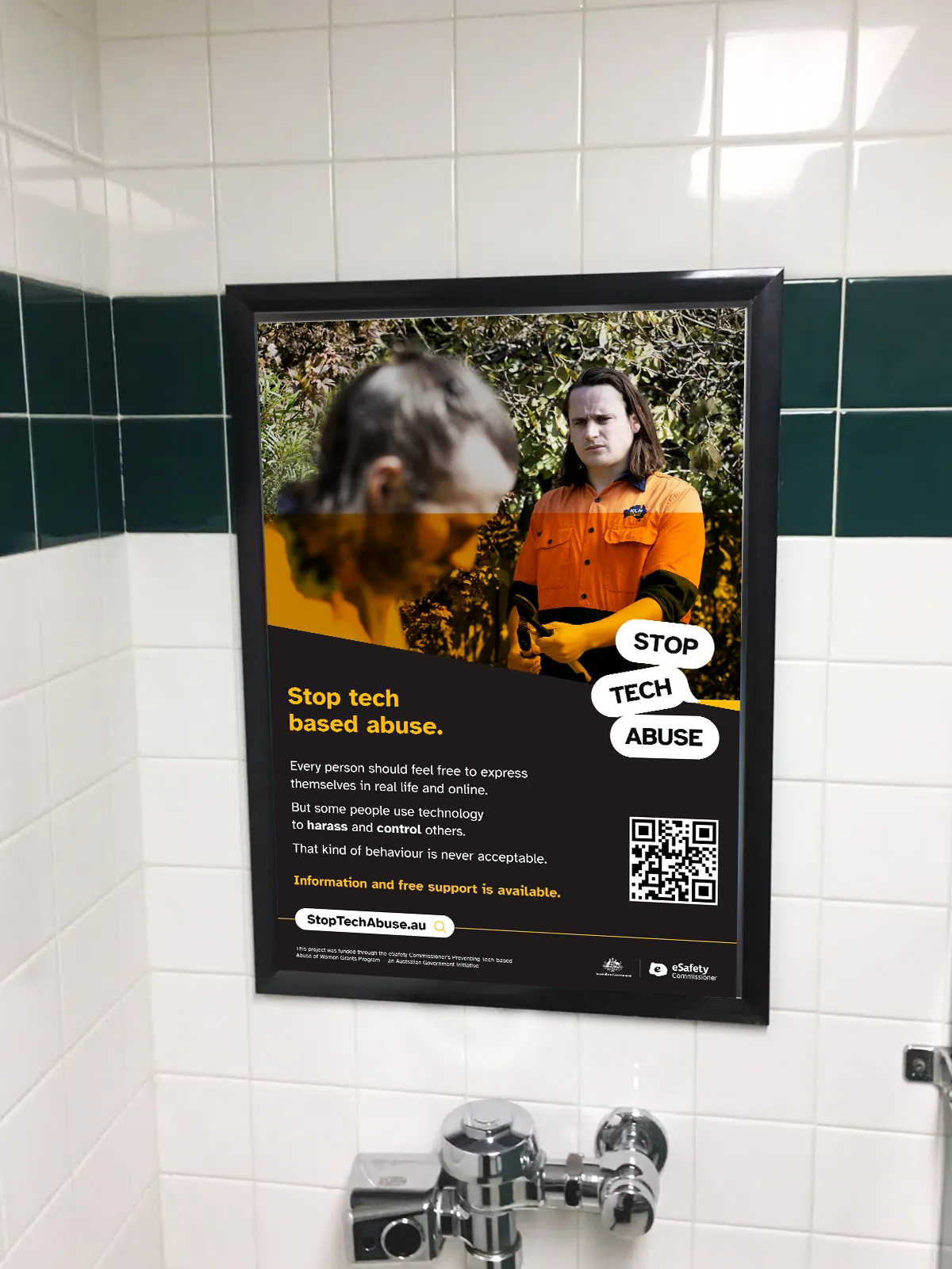
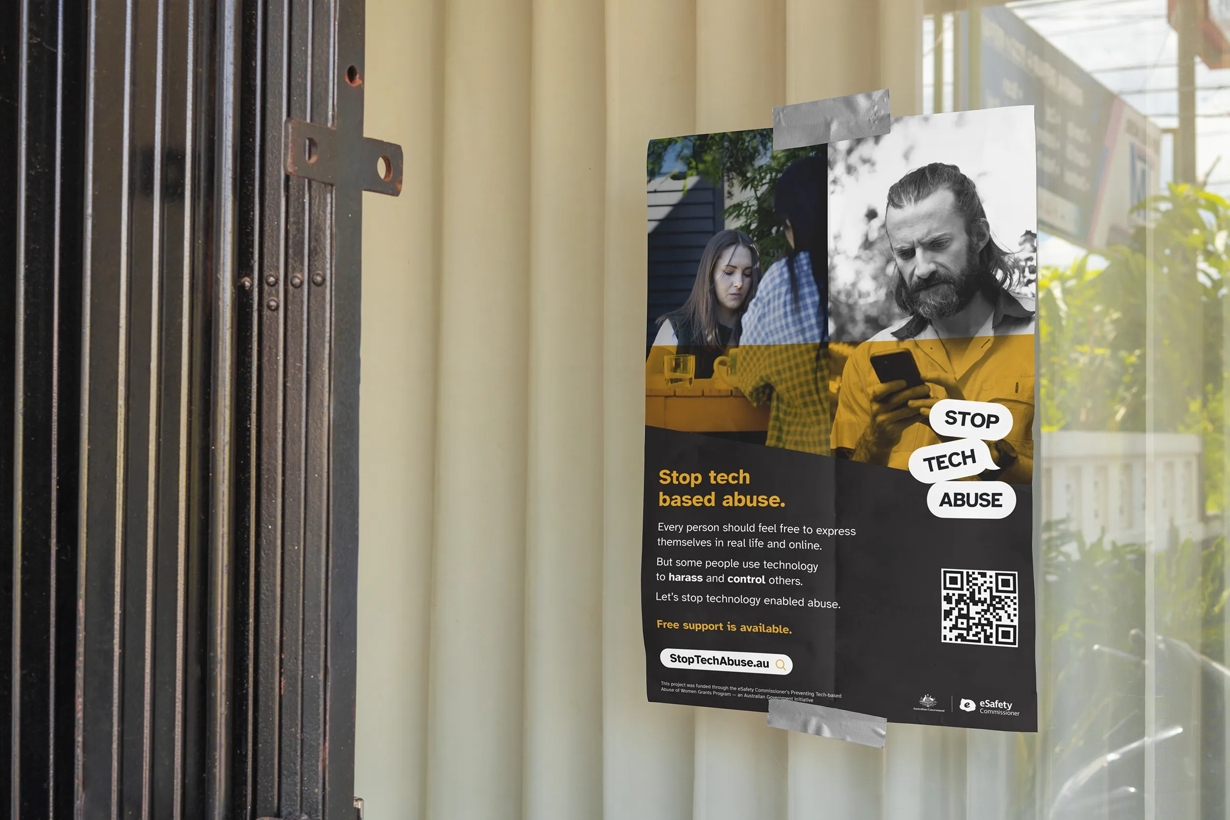
The logo mark draws on the visual language of a text exchange, using speech bubble forms that immediately signal digital communication. It was designed to perform well at any size: crisp as a favicon, legible as a pin badge, and commanding at poster scale. An animated version was produced for use in digital contexts and the campaign video.
Yellow, black, and white form the primary palette, with red and blue used sparingly as accents. The choice to lead with yellow was deliberate on two counts. Expert advice informed the team that red can provoke anger in viewers, which is the last thing a campaign like this should do. Yellow sidesteps that risk while carrying its own meaning: cowardice. Used as a full-bleed overlay in the campaign video, it visualises the mounting pressure of coercive control. On the website and in print, it commands attention without softening what the campaign is actually about.
The campaign uses Atkinson Hyperlegible, a typeface developed by the Braille Institute to maximise readability for people with low vision. It is free for commercial and personal use. A campaign designed to protect people should be readable by as many of them as possible.
The poster series was built around five audience archetypes:
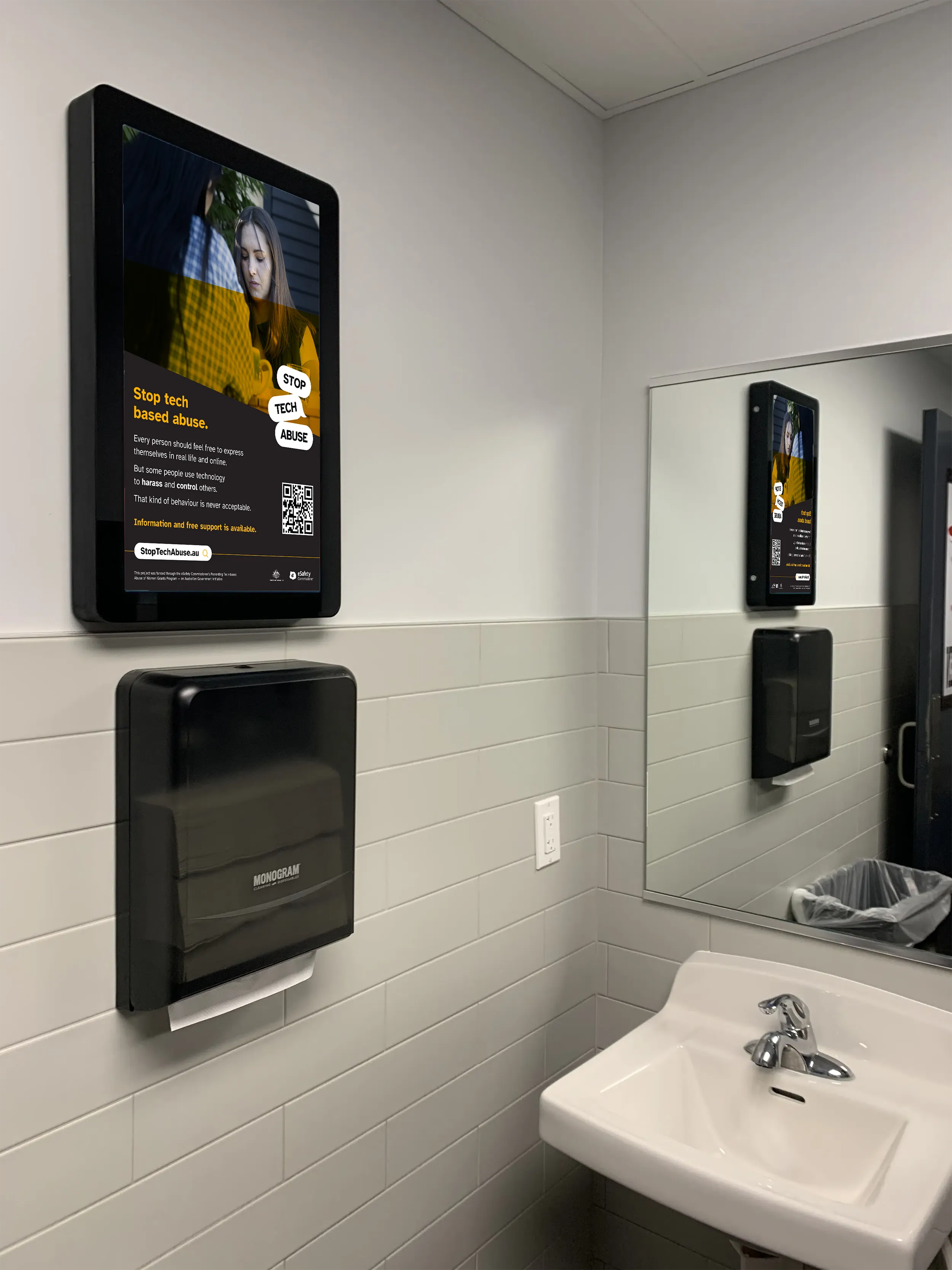
Each poster spoke directly to that person, covering what they might be experiencing, what they could do, and where to get help. Posters were placed where each archetype was likely to have a private, uninterrupted moment: pub bathrooms, community noticeboards, Country Women's Association branches, and sporting clubs.
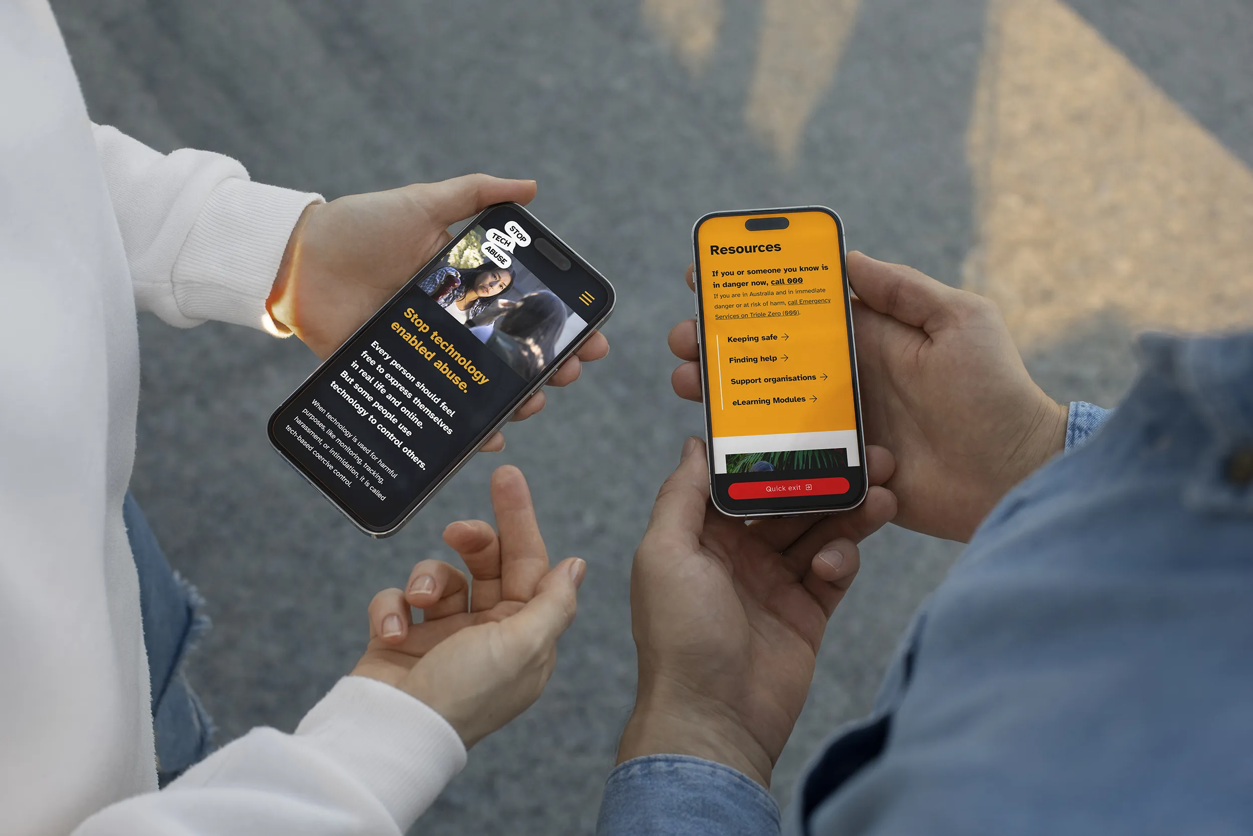
The website was built on WordPress using Bricks Builder, chosen for its cost-effectiveness and flexibility for Gippsland Women's Health to manage over time. The structure mirrors the archetype approach of the poster series. The site is intentionally lean, designed to connect people to specialist services rather than replicate them. The resources page brings together links to organisations that can provide direct assistance, so nobody has to go searching in a moment of crisis.
Accessibility
The yellow and black palette produces high contrast by nature. Atkinson Hyperlegible was chosen for its readability, and yellow was used over red on expert advice, as red can provoke anger in viewers. The site includes a quick-exit button so users can leave the page instantly if they need to.
Privacy
In small rural towns, being seen seeking help can put someone at greater risk. The poster series was placed in spaces where people were likely to have a private moment, rather than relying on digital channels alone. The quick-exit button addresses the same concern on the website.
Sensitivity
Gippsland Women's Health led all content and language decisions, informed by workshops with subject matter experts and women with lived experience. The design followed their guidance throughout.
Stop Tech Abuse launched across Victoria with a brand, website, and poster series that five regional Women's Health partners could pick up and run in their own communities. The campaign gave them a cohesive, credible set of tools and a clear way to reach people who might not have known where to turn.
When your organisation works with people in vulnerable situations, design has a direct impact on whether they feel safe enough to engage. I work with organisations tackling difficult subject matter to build brands and websites that are accessible, considered, and built to reach the people who need them most.