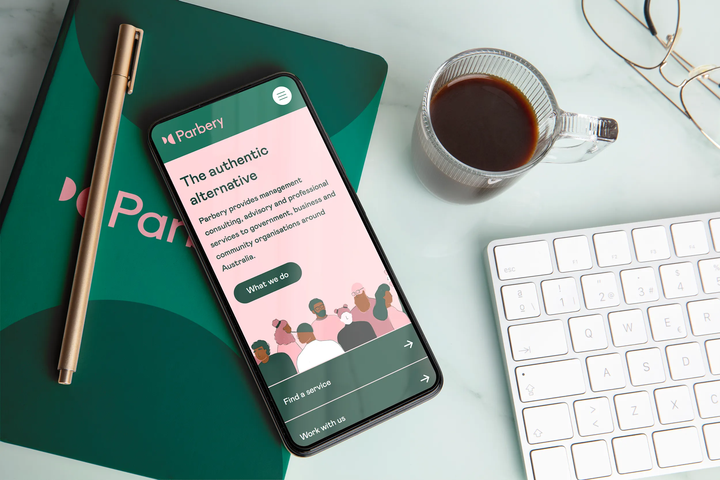
A Webflow site redesign for a Canberra-based consultancy doing brilliant work across government, for-purpose, and defence.
Parbery Consulting is a Canberra-based consultancy specialising in government, defence, and for-purpose work. They are one of the largest supporters of DVCS (another site I designed), and their commitment to purpose-driven organisations is unique and special.
Their prior WordPress site was managed by an agency with a tight grip on the reins. Changing a colour or adding an image meant raising a ticket and waiting. With a capable, hands-on marketing team ready to take ownership, that just wasn't working for them anymore.
What needed to be addressed:
The aim was to give Parbery a website that looked as good as the work they do, and that their team could actually run themselves.
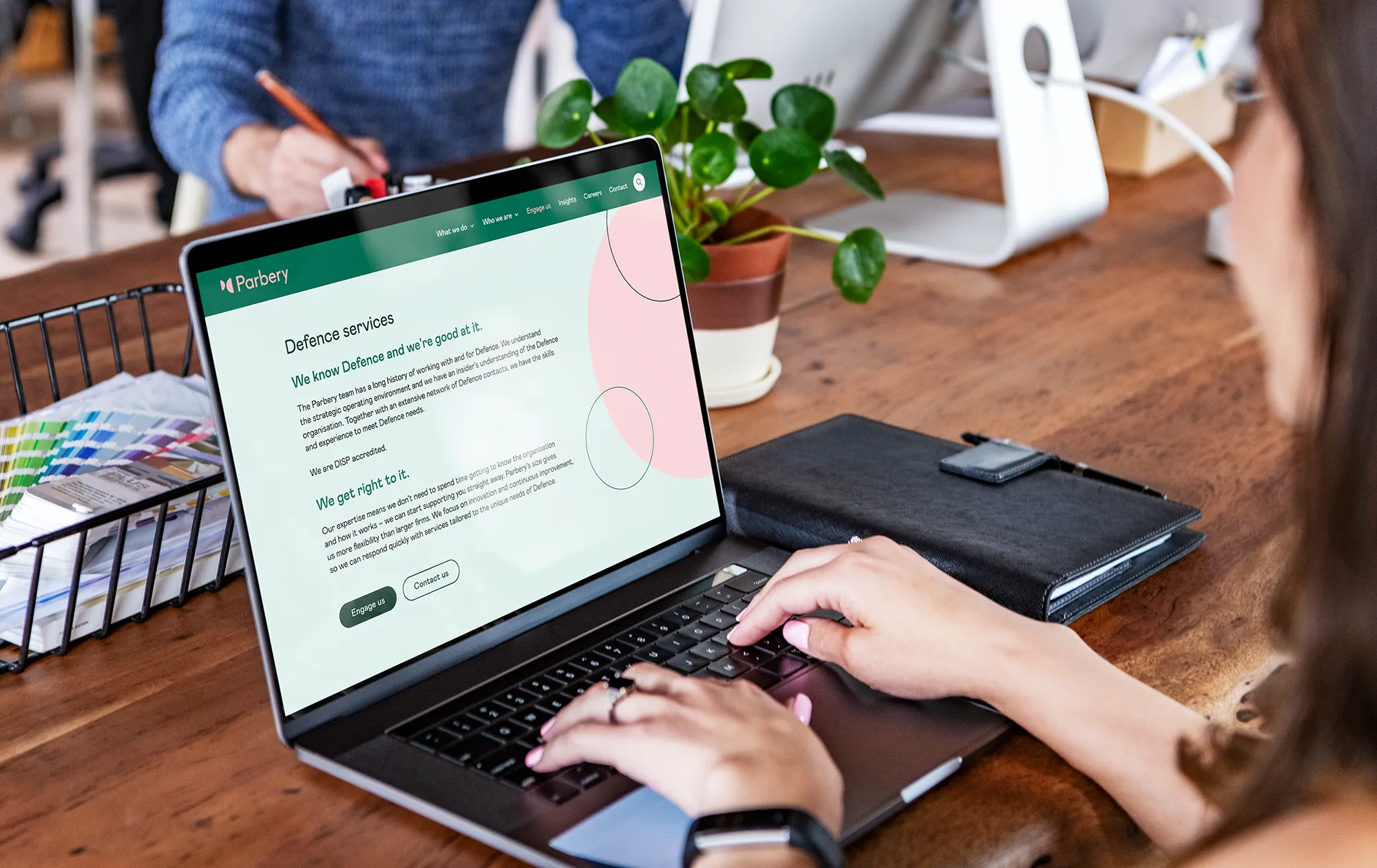
Parbery were actually one of the supporters who helped fund some of my work with DVCS. Getting to help them with their own website felt really special.
Honestly? I think this is one of the most beautiful websites I've built. The palette, the motion, the semicircles. What's not to love?
Parbery were an absolute dream to work with on accessibility. They were on board with every suggestion from the start, including expanding their palette to accommodate better contrast across the site. Focus states are code-driven, taking into account the background and using whichever of the two colours gives better contrast. Nothing to guess!
Typography hierarchy, colour contrast, and keyboard navigation were all considered across every page. The site meets WCAG 2.2 AA as a baseline throughout.
Parbery's new site launched, with the internal team loving the updated look and feel. Their marketing team can now update content, publish articles, and manage the site without any external help. Hosting is back under Parbery control! The CMS is set up to grow with them, and the blog is actually navigable for the first time.
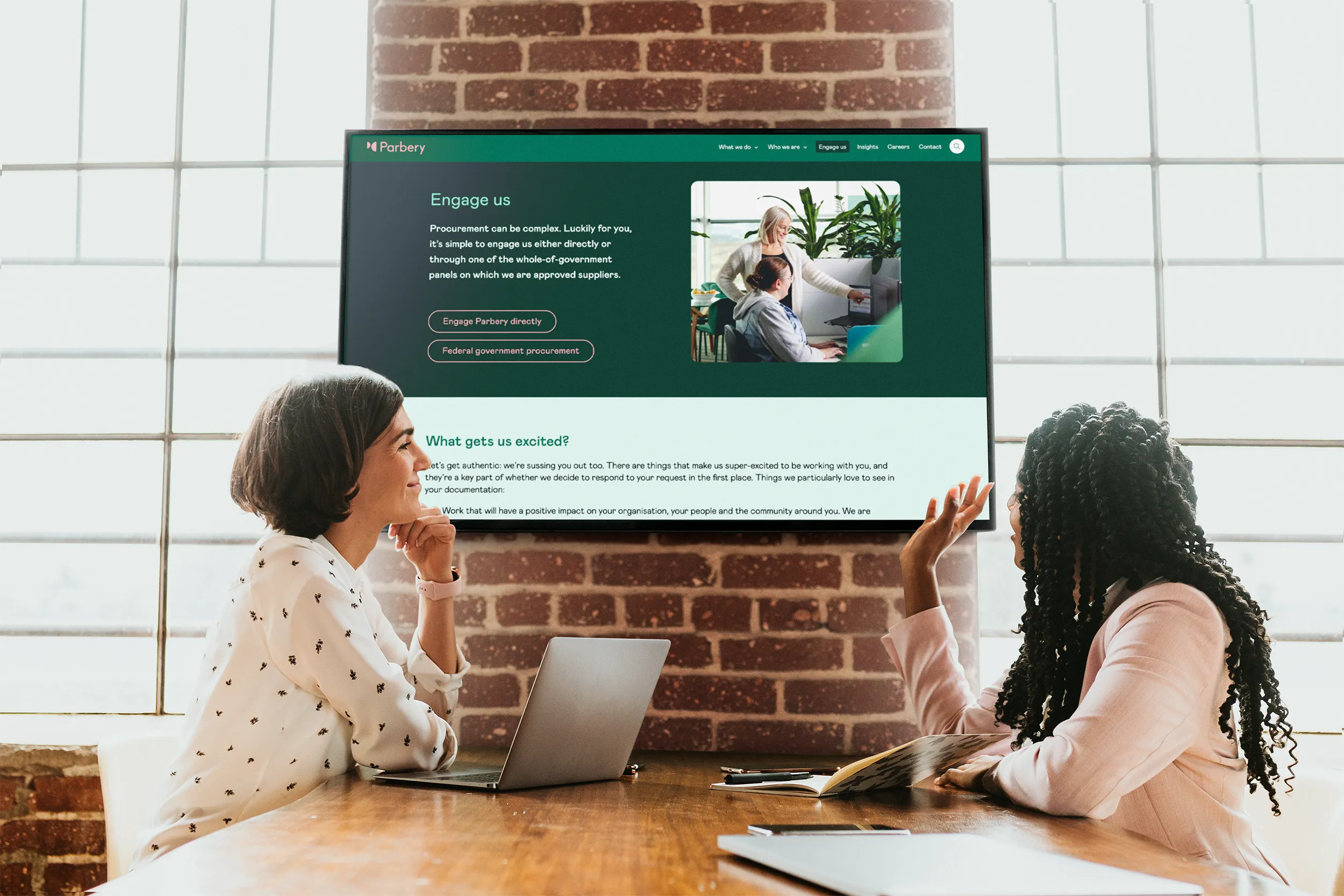
A great website should work for your organisation, not against it. Whether you need to move away from a rigid setup, give your team more control, or make sure your site reflects who you actually are now, let's build something that does all of that and looks the part too.
