A brand identity for a horse welfare not-for-profit with a philanthropic purpose
Homestretch Foundation is a not-for-profit dedicated to giving retired racehorses a life beyond the track. Alongside the horse welfare work, they support individuals in finding their own sense of purpose through personal growth and philanthropy. The brief called for a warm, earthy identity that could hold both sides of the mission together without feeling like two separate brands.
What needed to be built:
The brand needed to connect with two audiences: people who care about horse welfare, and individuals drawn to the personal growth and giving side of the work. Both needed to feel at home in it.
Not every project makes it across the line. This one didn't. The client chose to move on to a different designer, bummer!
But this project wasn't a waste for either of us. The work didn't disappear with the project. Their next designer inherited a client who had already worked through the hard questions about who they are and what they stand for. Sometimes the most useful work you do is the work that never has your name on it.
The brand was developed as a single unified identity, covering the logo suite, colour palette, typography, illustration assets and social media direction.
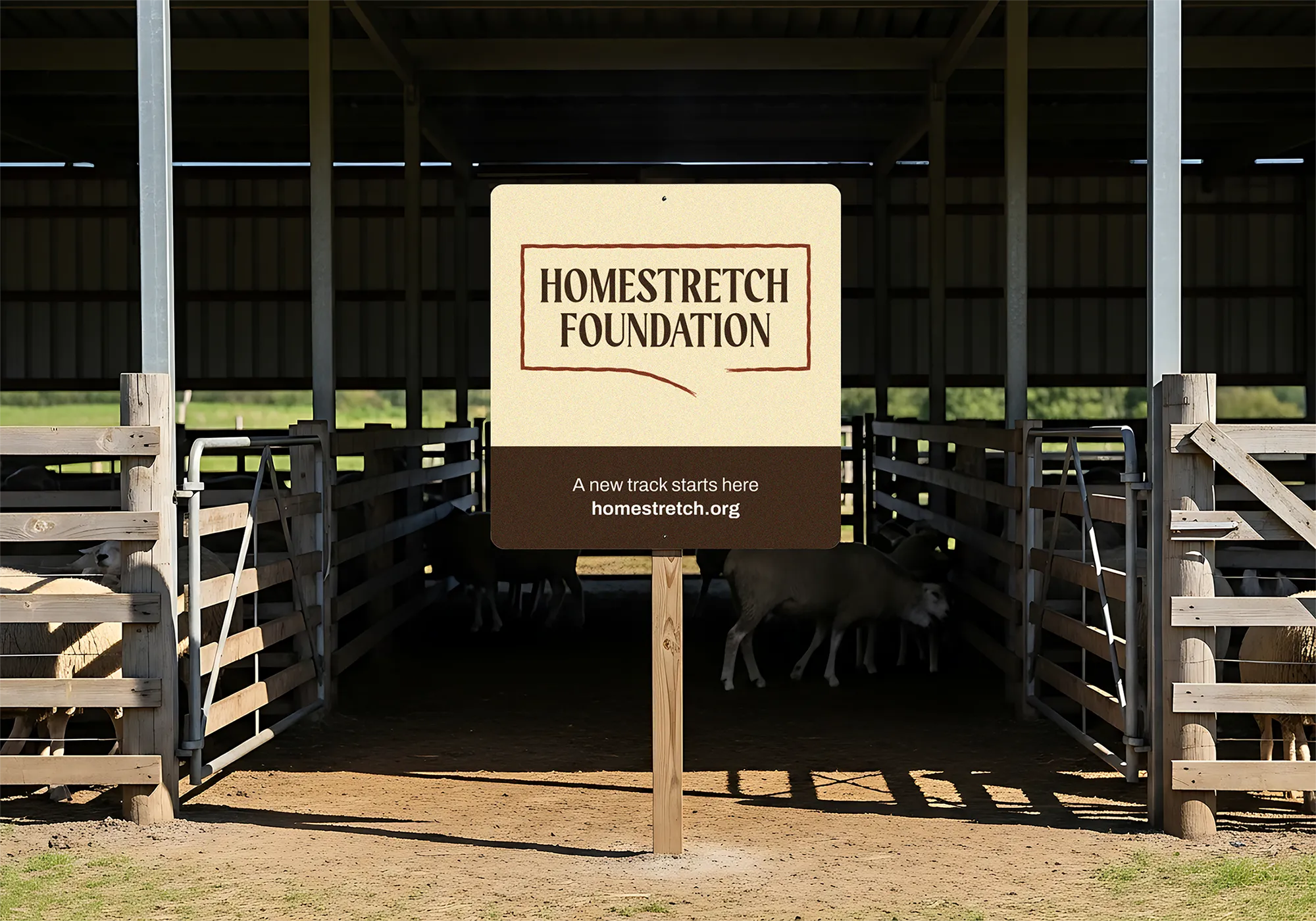
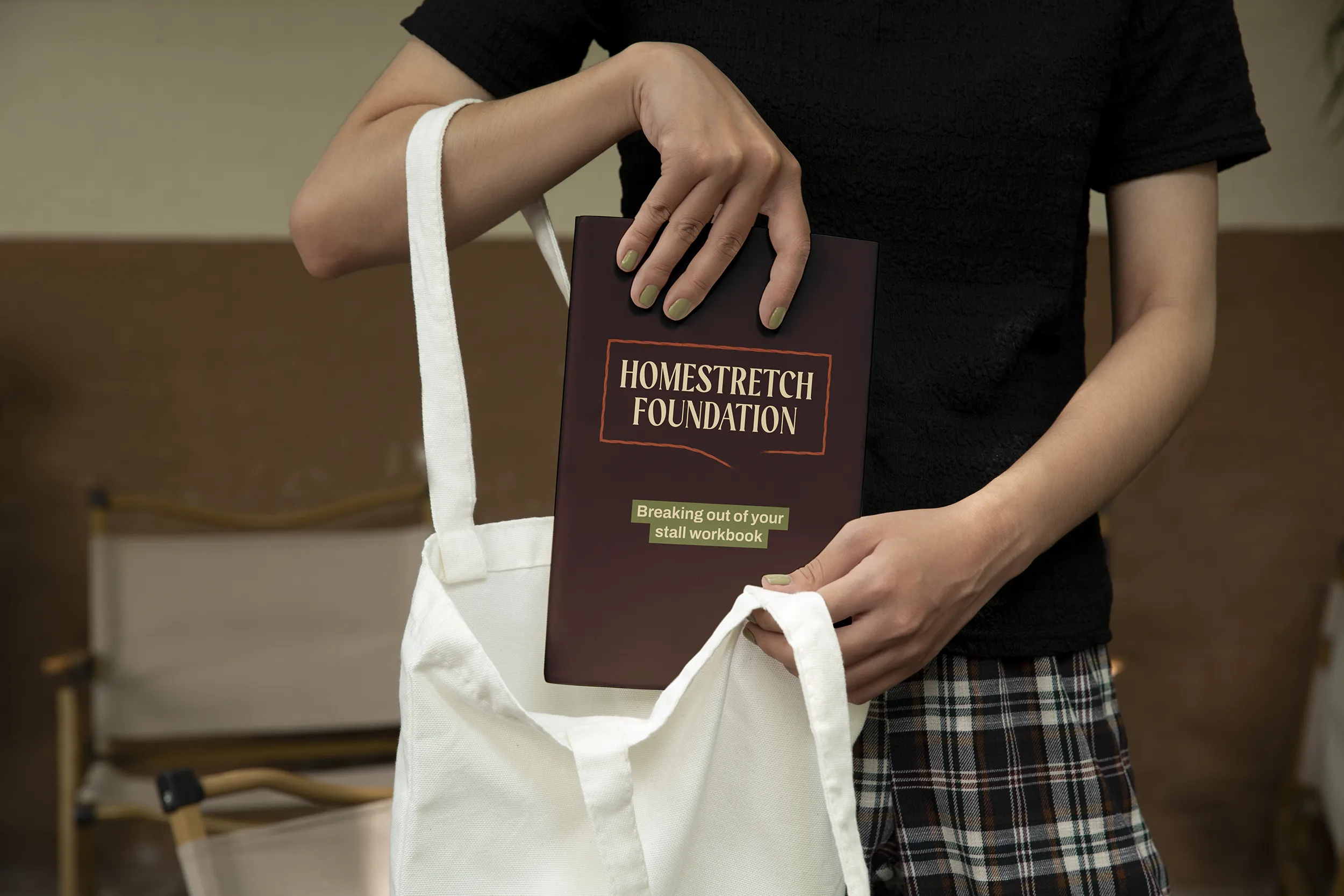
The primary logo uses a hand-drawn stall shape that doubles as a speech bubble, with a deliberate gap at the base. That gap is a nod to the idea that the barriers we build around ourselves aren't fixed. The stall works as both the physical space a horse occupies and a metaphor for being stuck. The wordmark sits inside, stacked so the second line can be swapped out for future programs without rebuilding the whole logo. A full suite of variations covers every application from primary logo through to favicon.
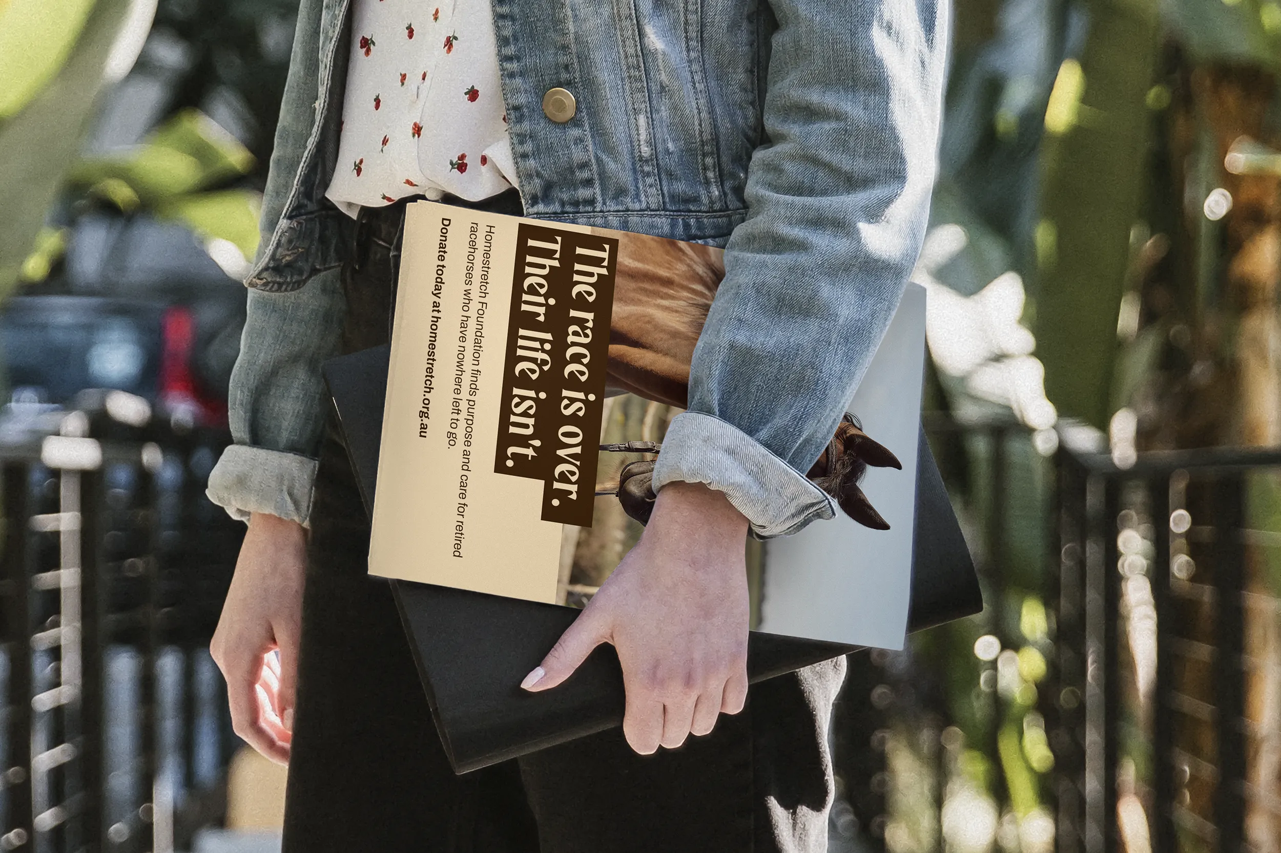
The palette runs across six named tones: Linen and Buttercream as the neutral foundation, Cinnamon as the signature colour (developed in two variations for contrast on light and dark backgrounds), Sage as an earthy counterpoint, Mahogany in place of black, and Seaspray as a cool accent to stop the palette reading too heavy.
Three typefaces carry the identity. The heading typeface has a warm, mid-century character that ties directly to the logo. The subheading typeface is a bold sans-serif used in a contrasting colour to create hierarchy. The body typeface is a clean serif with an italic cut suited to quotes and statement passages.
A suite of five hand-drawn illustrations brings personality to the brand: a heart, an open hand, a speech bubble, a bow and a horseshoe. A loose cinnamon thread runs through the visual system as the connective tissue across every touchpoint.
Contrast was considered from the start rather than checked at the end. The colour Cinnamon was developed in two variations specifically to hold sufficient contrast on both light and dark backgrounds. Mahogany replaces true black throughout, keeping contrast ratios in check while softening the overall feel. Typography hierarchy was resolved across every application: uppercase is reserved for display headings only, with mixed-case body copy to support readability at smaller sizes.
The subject matter needed care. The racing industry is one people feel strongly about, and the language and visual direction needed to lead with possibility rather than distress. The brand focuses on second chances and forward motion. Photography guidance steered toward warmth and the relationship between horses and people, avoiding imagery that could feel confrontational or place the animals in contexts of suffering.
This was a proposed brand identity that unfortunately didn't go ahead. The concept was presented in full, including the logo suite, colour palette, typography system, illustration assets and social media direction. The client chose to continue with a different designer. The work is shown here as a concept, because good thinking deserves to be seen. It also serves as a honest reminder that not every project ends the way you hope, and that's part of the job.
For not-for-profits and purpose-driven organisations, a strong brand isn't a luxury. It's how people find you, trust you and decide to support you. Let's build something that reflects the work you're actually doing.