A brand identity for a boutique business combining traditional costume and prop making with modern technology.
Kiri and Will create bespoke LED-integrated costumes and props for performers, cosplayers, and artists. Their pieces are handcrafted, technically impressive, and genuinely a little magical. As a new business, they needed a brand identity that could walk into a room and hold its own from day one.
The work included:
I am not just the designer on this one. I commissioned a digital name badge from Kiri and Will that I can animate with my own brand assets, and without fail, it turns heads at every networking event. People always want to know where they can get one.
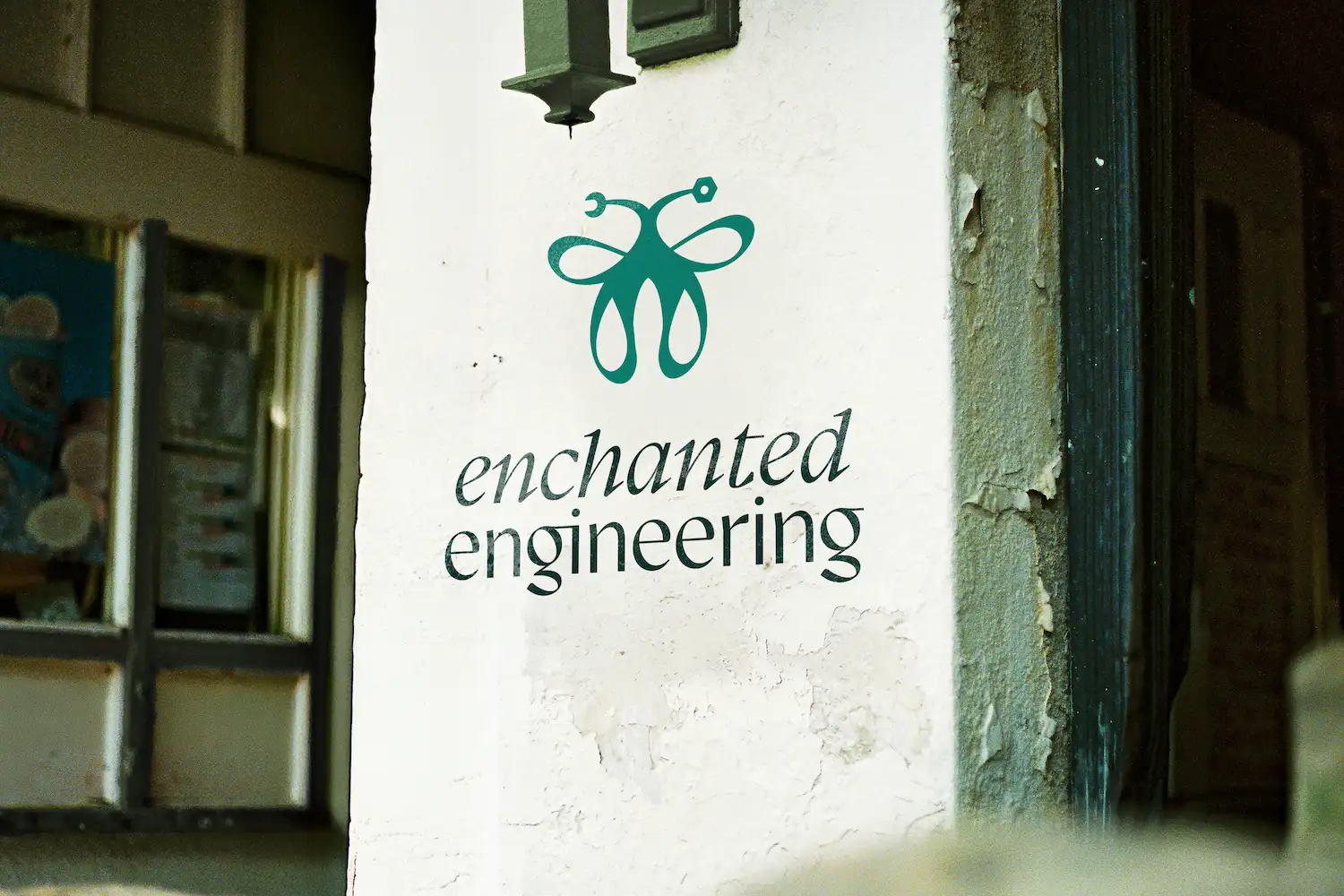
The brand identity for Enchanted Engineering captures the same whimsy and precision that Kiri and Will pour into every piece they make. From the logo construction through to the colour palette and typography, every decision adds up to a brand that leaves an impression.
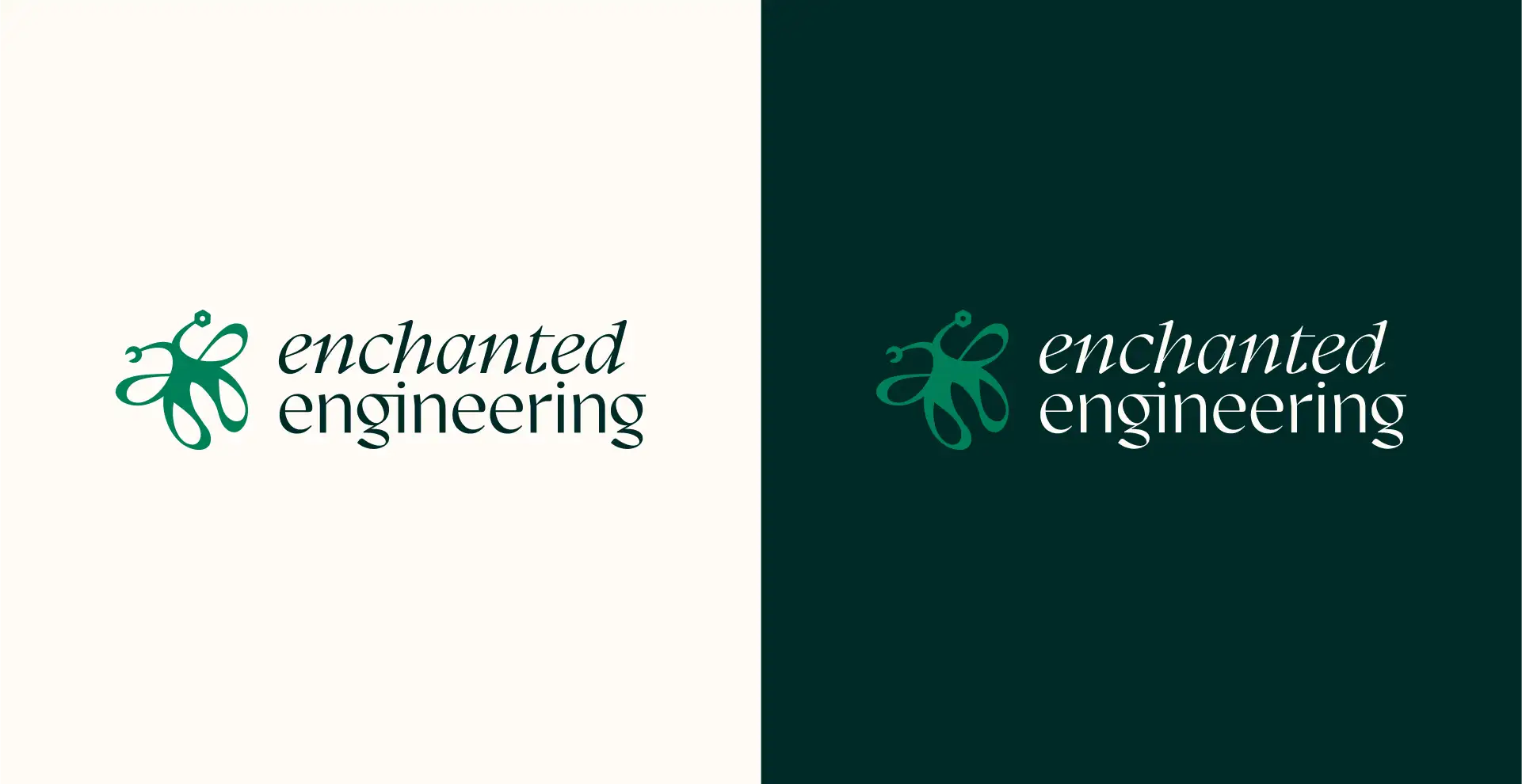
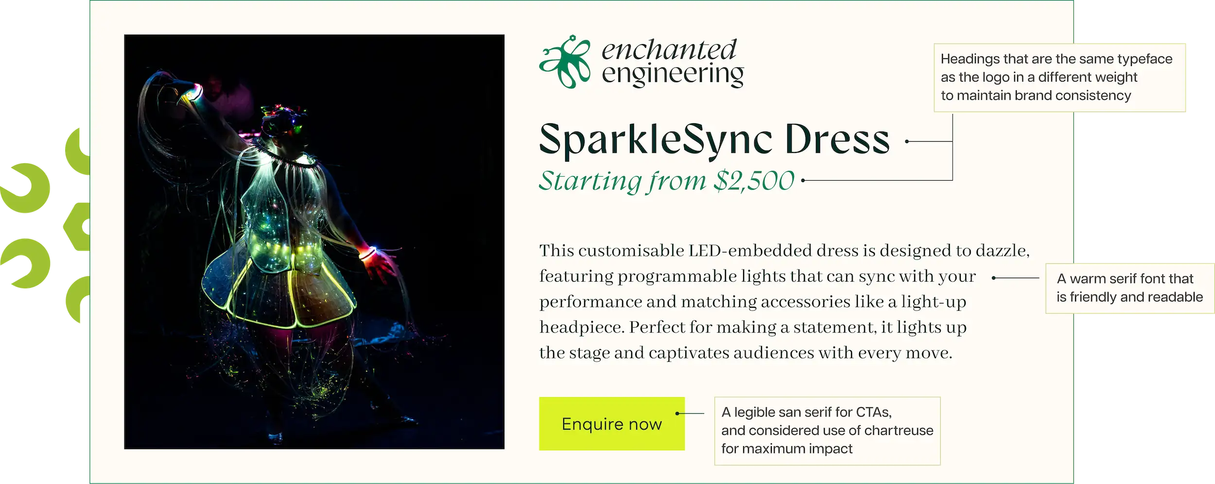
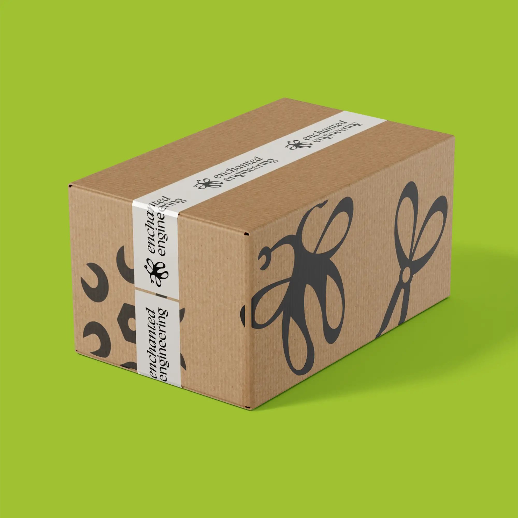
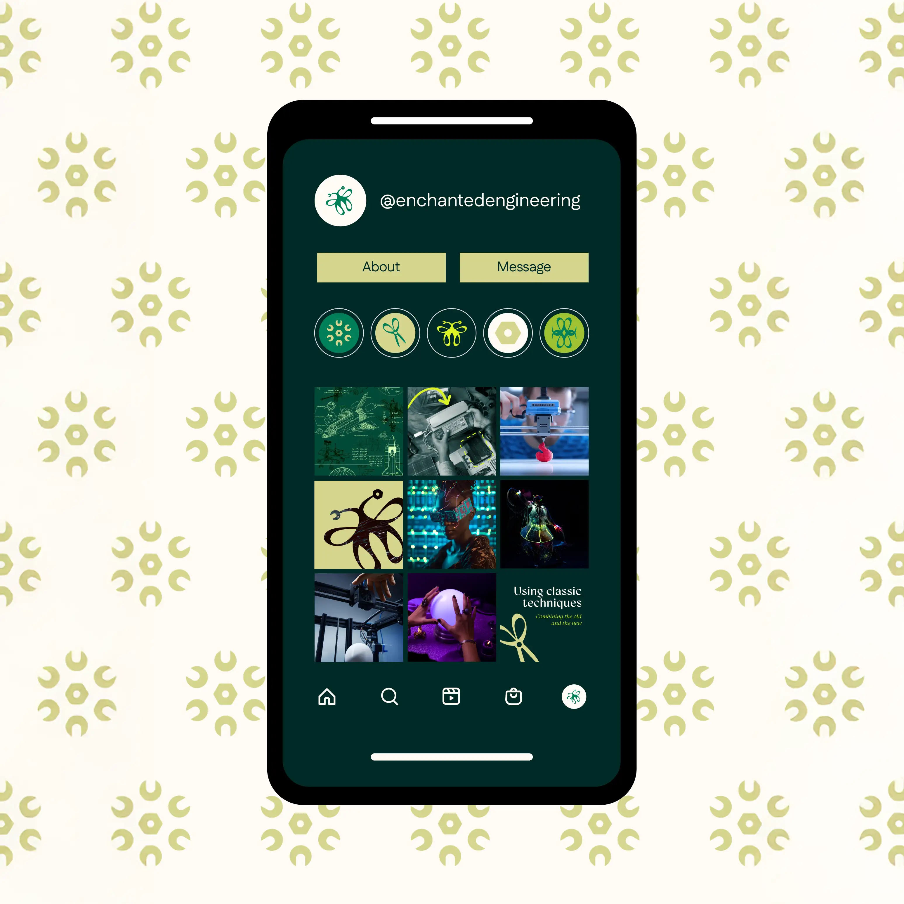
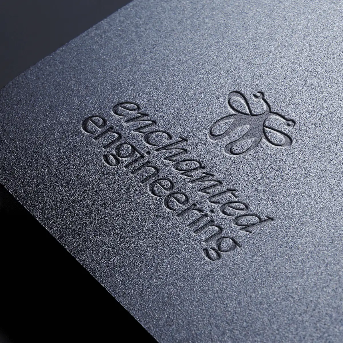
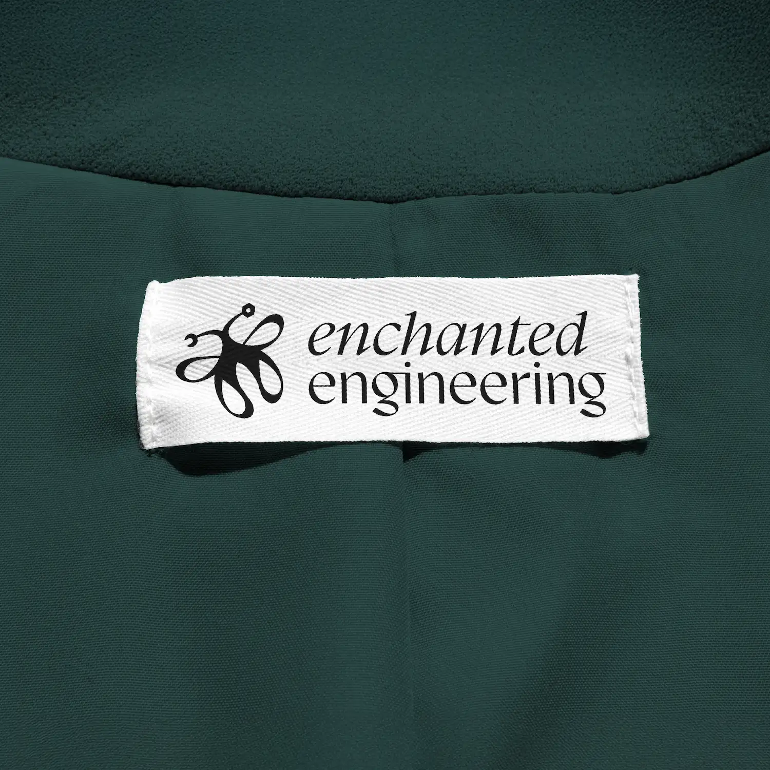
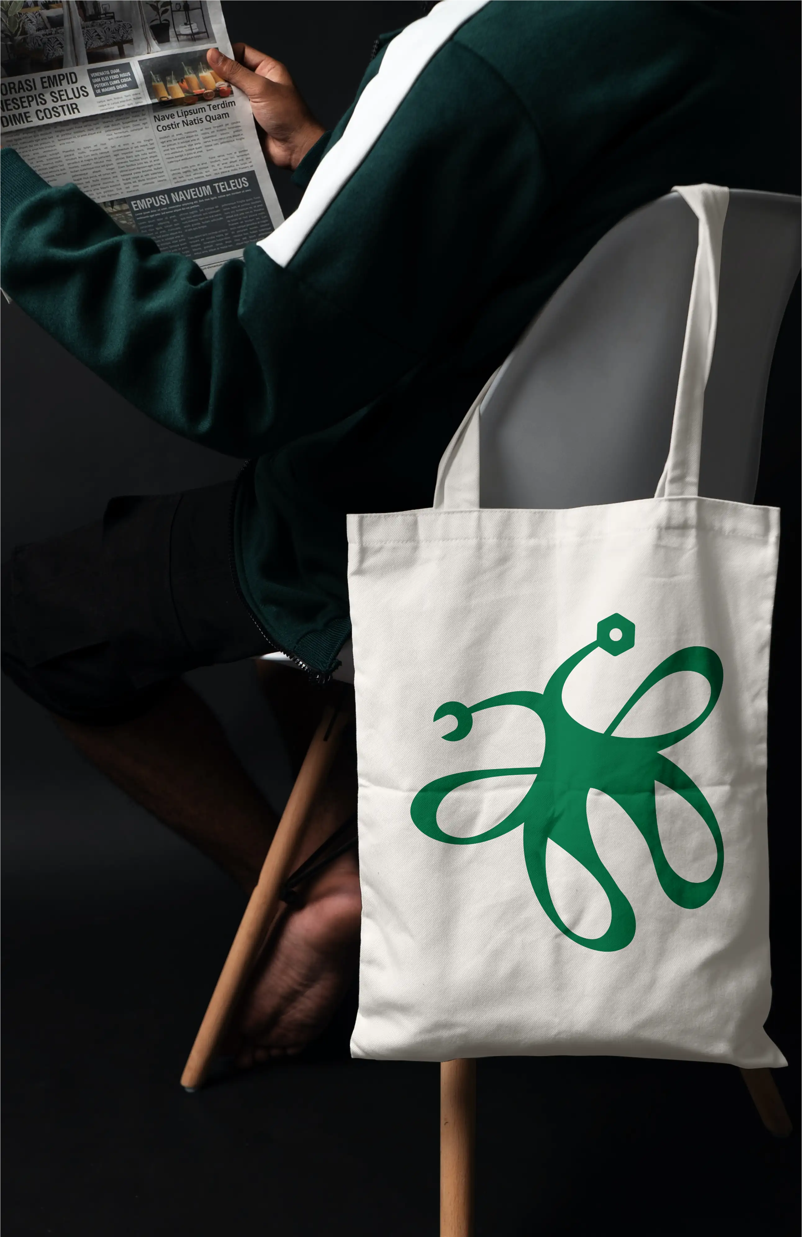
The butterfly-wrench mark is formed from the italicised 'E' of "Enchanted," with a wrench sitting along the antennae. One image, two worlds: handcraft and engineering, sitting together exactly where they should be.
A jewel-toned emerald anchors the palette, with chartreuse as a buzzing accent and warm beige to give everything room to breathe. Every combination was tested for contrast compliance and colour blindness accessibility.
Gyst leads the headings with a 1970s energy that feels nostalgic and a little otherworldly, paired with a serif for body text and a clean sans serif for legibility at smaller sizes. It is a variable weight font, which means as the brand grows into motion and digital, the type can move with it.
Hand-drawn chartreuse overlays, circuit-board patterns, and a set of logo-derived icons round out the system. The scissors icon is drawn directly from the butterfly 'E,' so everything feels like it belongs to the same world.
Accessibility was built into the brand system from the start. The full colour palette was tested for contrast compliance and checked against common types of colour blindness, so the brand works for a wide range of people regardless of how they see colour. The chartreuse and emerald greens were chosen partly for how well they hold up when viewed with altered colour perception, keeping them distinct and useful even when the full range of colour is not available.
The logo was tested at multiple sizes, from favicon to billboard, to confirm it holds its structure and legibility at every scale. Typography was reviewed for readability and hierarchy, and the brand guidelines include specific colour pairing guidance so Kiri and Will can create their own assets confidently without accidentally producing inaccessible combinations.
(Psst, you can check how your own colours stack up using my Multi-colour contrast checker)

Enchanted Engineering launched with a brand that gives their work the setting it deserves. The butterfly-wrench mark is distinctive enough to stand alone as an icon while remaining legible and clear in a full lockup. Kiri's reaction on seeing the finished work said it simply: it looks grown up.
The brand guidelines give Kiri and Will a working system they can rely on as they create content and marketing materials on their own. Colour pairing guidance, typography hierarchy, and a full icon set mean they can move quickly and confidently without starting from zero every time.
The identity is built to grow. As Enchanted Engineering moves from boutique operation to recognised name in the performer and cosplay world, the brand has the range and the magic to keep up.
When you are doing something genuinely unlike anything else out there, your brand needs to communicate that clearly and confidently. Whether you are launching from scratch or growing into something bigger, I can help you build an identity that earns trust, reaches the right people, and holds up everywhere your business shows up.