Orange is gorgeous. Vibrant, warm, energetic.
It shows up everywhere from tech startups to juice brands to nonprofits that want to feel approachable and optimistic. But here's the thing about orange: it's a nightmare for accessibility.
Not because you can't make it work. You can. But the number of caveats, compromises, and individual variations you have to navigate means orange will always fight you when you're trying to design something inclusive.
Let me explain why.
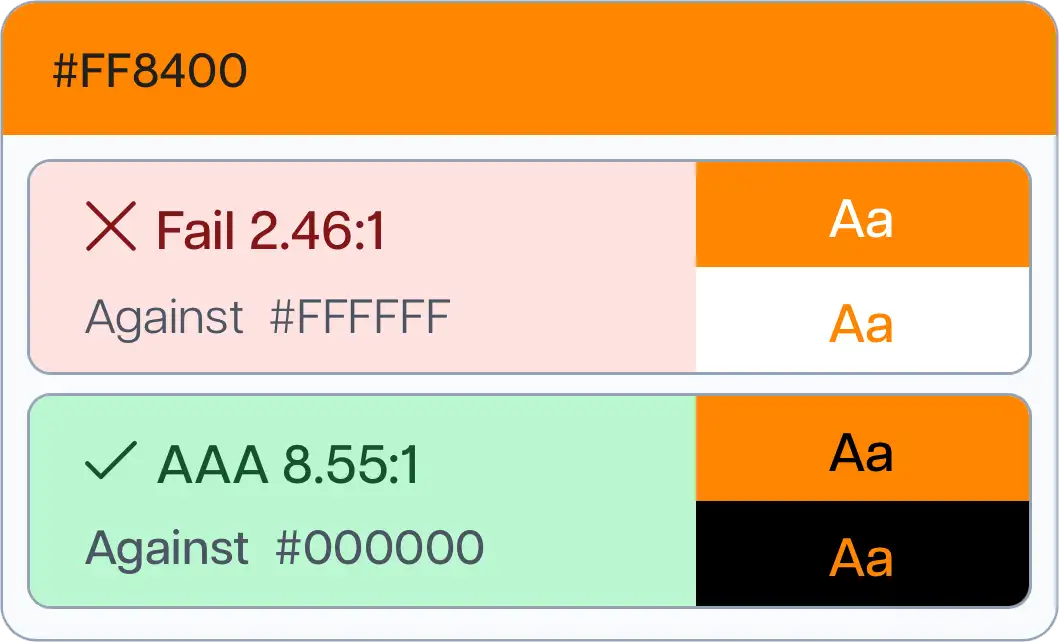
Most colours give you a clear answer when it comes to text contrast. You run it through WCAG (Web Content Accessibility Guidelines), and you get a pass or fail. Black text passes, white text fails. Or the other way around. Done.
Orange doesn't do that.
With a bright, vibrant orange (the kind that actually looks like an orange), white text usually looks better visually. It feels modern, clean, and legible. But white on orange almost never passes WCAG contrast requirements for accessibility.
Black text, on the other hand, does pass. Technically, black on orange is the accessible choice. But it looks strange. Off. Like a Halloween decoration or a budget traffic sign.
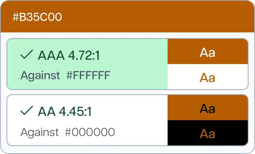
If you try to fix the orange by darkening it enough to make white text pass WCAG, you end up with a murky orangey-brown that no one wants to look at, let alone build a brand around.
So you're stuck. The version that passes accessibility standards doesn't look good. The version that looks good doesn't pass. And the version that technically works visually isn't actually the version people prefer.
A 2019 case study by Ericka O'Connor from Bounteous tested orange buttons with about 20 colour-blind participants to see which combination was easier to read: white text on orange, or black text on orange.
The results showed that 61% of users preferred white text on orange, even though black text was the WCAG-compliant option. But when they broke it down by type of colour blindness, the preferences split. Some types of colour blindness strongly favoured white text. Others preferred black. One participant with monochrome colour blindness favoured black text.
The study also found that some users experienced physical discomfort with the black text option. Participants reported issues like headaches, a halo effect around the text, and buzzing on the screen, even though black text was technically the more accessible choice according to contrast ratios.
This is the problem with orange. Accessibility is supposed to make things simpler and more intuitive for everyone. Orange does the opposite. It introduces ambiguity, individual variation, and trade-offs that shouldn't exist in the first place.
β

β

β
Clients come to me at all stages of their brand journey. Some are just starting out. Others have been in business for years, with orange woven through their entire visual identity: their logo, their website, their print materials, their social media.
And when we start talking about accessibility, orange becomes a problem that's exponentially harder to solve the longer it's been in place.
Brand colours aren't just aesthetic. They carry meaning, recognition, and emotional weight. Changing a primary brand colour is a big deal. It's not impossible, but it's disruptive. And if accessibility wasn't part of the conversation when the brand was built, fixing it later means retrofitting, compromising, or starting over.
That's why I won't use orange as a primary colour for any client, especially one that prioritises accessibility. The risk isn't worth it. The limitations are baked in from the start.
I have used orange for clients as a secondary or accent colour. That works. But as the primary colour? The one you're putting text on, using for buttons, building your whole system around? No.
This isn't a pile-on. If orange is your brand colour, you're not doing something wrong. You're working with what you've got, and that's fine.
But it is worth revisiting how you're using it.
Are you putting white text on orange and hoping no one notices it doesn't pass contrast checks? Are you using black text and wondering why it feels off? Are you guessing at what works instead of testing it properly?
You don't have to rebrand. But you might need to rethink how your colours interact with each other, and whether there's a way to use orange more strategically without sacrificing accessibility.
This is exactly why I built the multi-colour contrast checker. It's not just about checking one colour against another. It's about seeing how your whole palette works together, across different colour blindness types, so you can make informed decisions before you're locked in.
If you're in the early stages of building or refining your brand, this is the time to check. Not two years from now when you're trying to retrofit accessibility into a system that was never designed for it.
Orange might look great in isolation. But accessibility doesn't happen in isolation. It happens in context, across devices, across abilities, across real people using your website or product.
Check your colours. Make sure they work. And if orange is part of your plan, go in with your eyes open about what you're signing up for.
If you need help figuring out whether your current brand colours are working, or how to adjust them without losing what makes them yours, reach out. This is exactly the kind of thing I help clients navigate.
Stay excellent,
Shannon π
β
Spend a day with me focused on your most important brand or website updates. Together weβll turn your ideas into action and finish whatβs been waiting on your list.