A brand refresh and new website for a Melbourne accounting firm that's anything but boring.
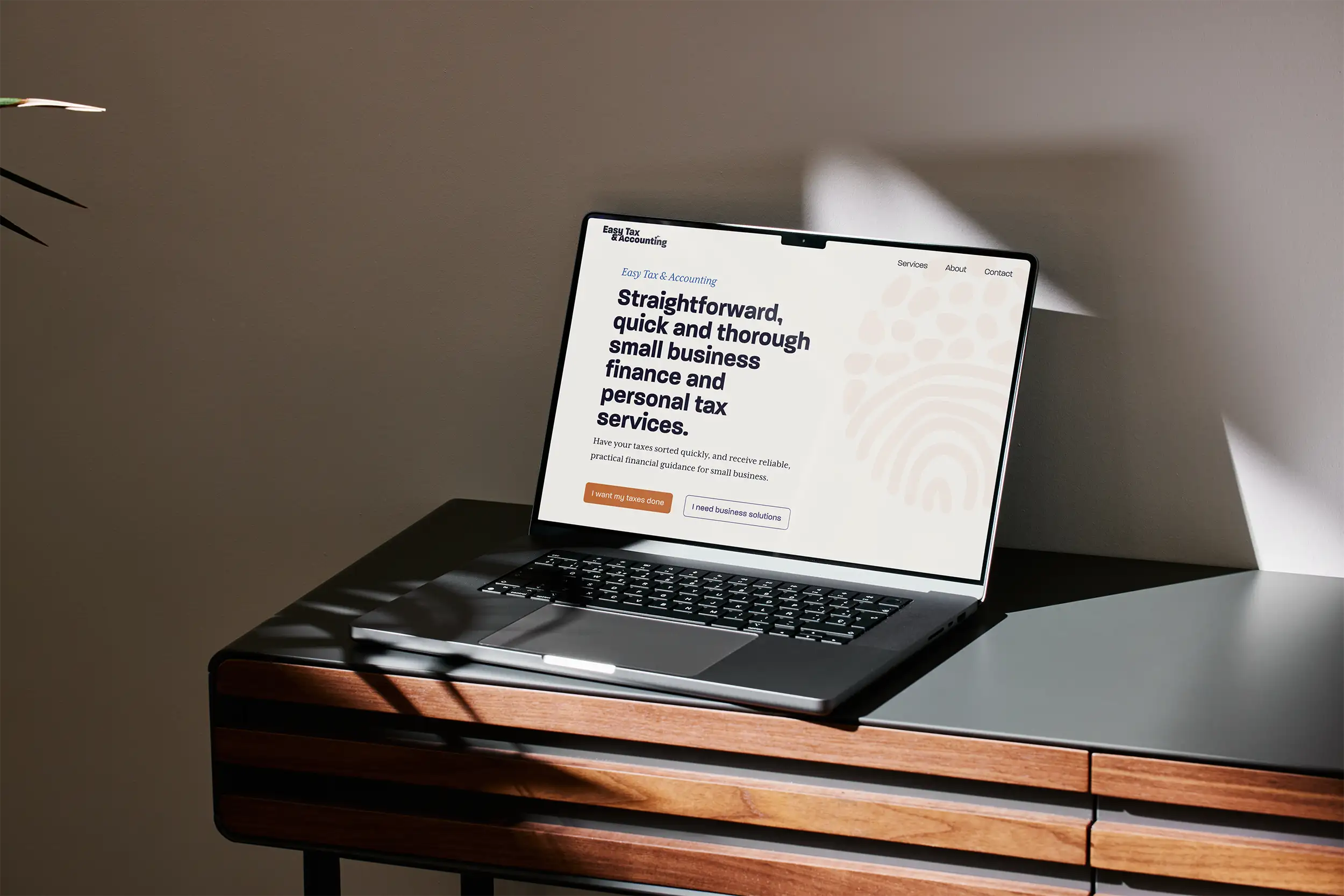
Easy Tax & Accounting is a Melbourne-based accounting firm founded by Douglas McCracken-Skeggs, specialising in tax and financial services for medical professionals and small business owners. The business had grown steadily on reputation and word of mouth, but the digital presence hadn't kept pace. The website was nearly a decade old, missing their logo entirely, and the brand lacked the consistency and personality that reflected the quality of their work.
What needed to be built:
This wasn't a growth play. It was about a thriving business finally having a brand and website they could feel proud of.
I've been a client of Easy Tax & Accounting since 2019. Every time I used the old website, I was quietly redesigning it in my head. The logo wasn't on it. There was just a picture of a briefcase. Getting the chance to fix it properly was genuinely satisfying. Doug and his team are excellent at what they do, and the brand now actually reflects that.
The original logo's dot motif was a recognised mark worth keeping. The refresh retained and refined those dots, giving the identity a thread of continuity while lifting everything around it. It feels like itself, just better.
Standard accounting palettes reach for blue and red. Easy Tax & Accounting went orange, purple, and blue instead. The combination is warm, confident, and immediately distinct from the competition. It signals approachability without sacrificing credibility.
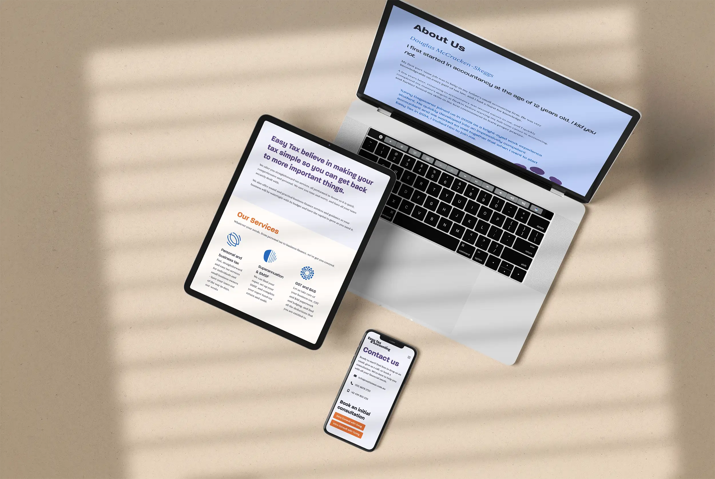
The type pairing earns its keep on both ends. A clean, highly readable sans-serif takes the headings with quiet authority. A classic serif handles the body copy, anchoring the brand to something that feels responsible and considered. The italic cut of the serif adds a flash of personality in subheadings without the whole thing tipping into frivolous.
Abstract circular illustrations were developed to sidestep the stock photo clichés that saturate the finance sector. They give the brand visual breathing room and help distinguish each service without resorting to staged handshakes or suspiciously happy people pointing at spreadsheets.
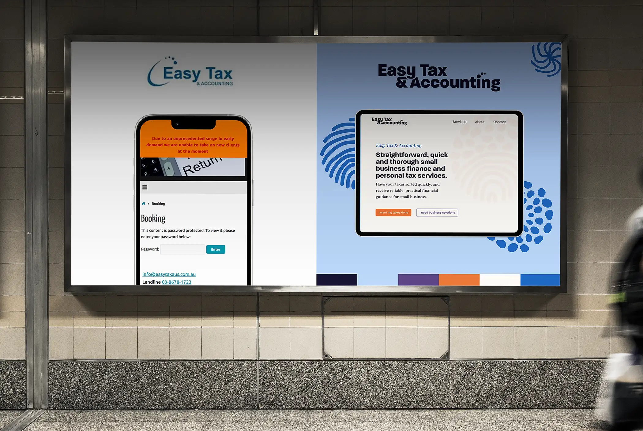
The site was built in WordPress using Bricks Builder, with pages for home, services, about, contact, and appointment booking. The structure is clean and straightforward, built for visitors who already know they want to work with Easy Tax & Accounting and just need to find what they're looking for. Minimal complexity, nothing unnecessary, and very little that could go wrong.
The non-standard colour palette required careful contrast testing across every combination to meet WCAG AA standards. Typography choices prioritised readability throughout, with a clear hierarchy and generous sizing across all screen sizes.
Privacy was considered carefully across the contact and booking functionality. Easy Tax & Accounting's client base includes people who reasonably expect discretion about their financial affairs. Forms were kept minimal, collecting only what was needed at the point of first contact, and no unnecessary personal information was requested upfront.
Doug received a wave of positive feedback from clients on both the new brand and the website. The goal was never to chase more work. It was to have something worth being proud of, and something that just ran. On both counts, it delivered. The site has needed very little attention since launch, which for a business that stays full through word of mouth alone, is exactly the goal.

Not every project is about chasing new clients. Sometimes it's about having a brand and website that finally match the quality of your work. If your business has outgrown its digital presence, let's fix that.