A brand identity and website for Australia's accessibility, usability, and communication conference.
AUCUA (Australian Communication Usability and Accessibility conference) was a one-day online event co-founded by Shannon Towell and Narelle Wright of DASAT, built on a simple observation: the Australian accessibility community deserved a dedicated conference that was affordable, practical, and led by people who actually live this work. Shannon took on the branding and built the site from scratch.
What needed to be built:
Every decision across the brand and site came back to the same question: does this work for everyone?
I co-founded AUCUA with Narelle because I genuinely believed it needed to exist. We spent eight months building something from nothing, and the 2024 conference was a good day. A second year didn't happen. I've made peace with that. Some things you build to prove something to yourself, and that's reason enough. Not every project becomes permanent. Some just become proof that you're willing to try.
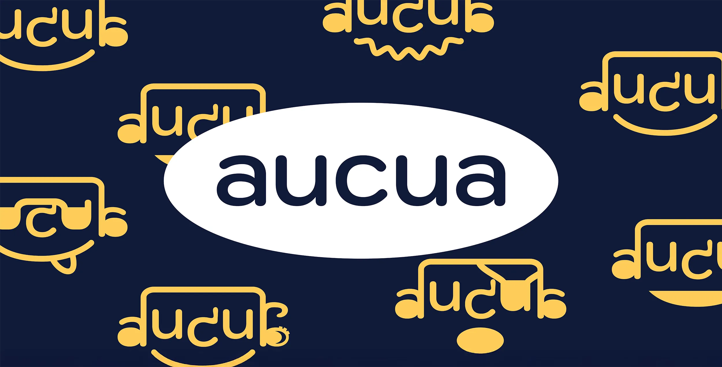
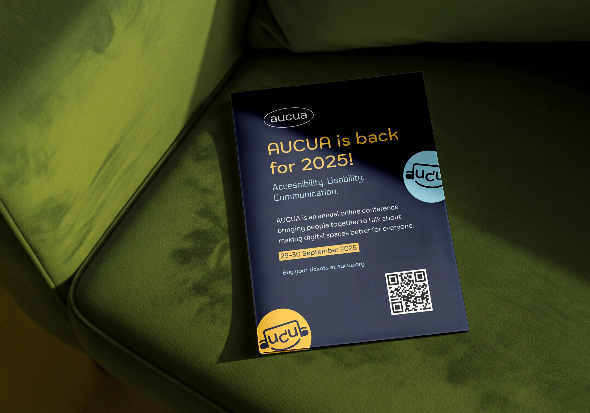
AUCUA is a palindrome, and in lowercase the letterforms read like a face: the a's become ears, the u's become eyes, and the c a nose. That gave the mark a natural expressiveness, with different moods possible across applications. The logo holds its structure at every size, works in a single colour, and carries a quiet sense of humour that fits the conference's tone without trying too hard.
The palette is navy blue, light blue, white, and yellow. It draws from DASAT's existing brand and Shannon's own without belonging entirely to either, landing somewhere distinctive and new. All pairings were tested to WCAG 2.2 AA standard, with key combinations meeting AAA.
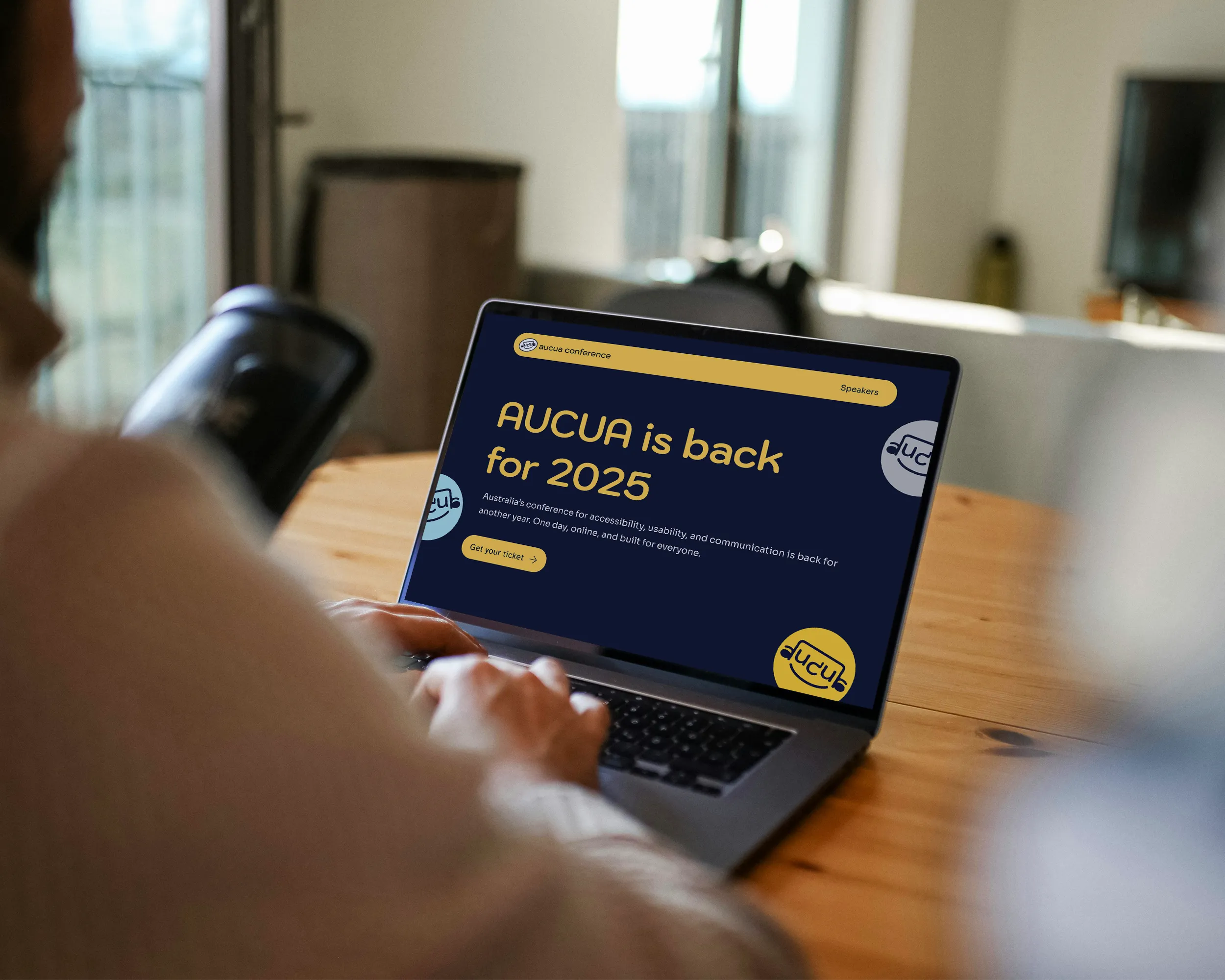
The heading typeface is rounded and expressive, with enough character to carry the brand at display size while staying fully legible. The body typeface was chosen specifically for its accessibility credentials and its performance at small sizes. Together they sit just right between personality and clarity.
The site was built in WordPress using Bricks Builder, across four pages: Home, Speakers, Schedule, and a 2024 Conference archive housing the full session recording playlist. Skip links, keyboard navigation, and colour contrast testing were built in from the start, not added as an afterthought.
Accessibility was a founding principle of AUCUA, which meant the bar for the site was always going to be high. All colour pairings were tested against WCAG 2.2 AA requirements, with several hitting AAA. The site includes skip links and full keyboard navigation, so attendees using assistive technology could move through the content without friction. One of the conference's co-founders navigates the web with a screen reader, so accessible markup wasn't a checkbox. It was the baseline.
The 2024 AUCUA Conference brought together eight speakers from across the design, development, marketing, and behavioural science communities for a full day of practical conversation about accessibility, usability, and communication. Attendees appreciated the depth of discussion that the intimate format made possible. The session recordings from 2024 remain available as a free resource for the broader accessibility community.
Accessibility should be built in from the beginning, not added later. Whether you're starting a brand from scratch or rebuilding a site that's falling short, I can help you create something that works for everyone and looks like it was made with care.