A brand refresh for an international engineering consultancy that had outgrown its original name.
The name Audio Systems Logic made perfect sense once. Then ASL grew into something far bigger. As an international consultancy delivering AV, vertical transportation, electrical, mechanical, and ICT services across entertainment, healthcare, hospitality, and corporate sectors, the business had expanded well beyond audio. The brand needed to catch up.
What needed to be built:
ASL knew what they wanted. These goals made sure the brand delivered it.
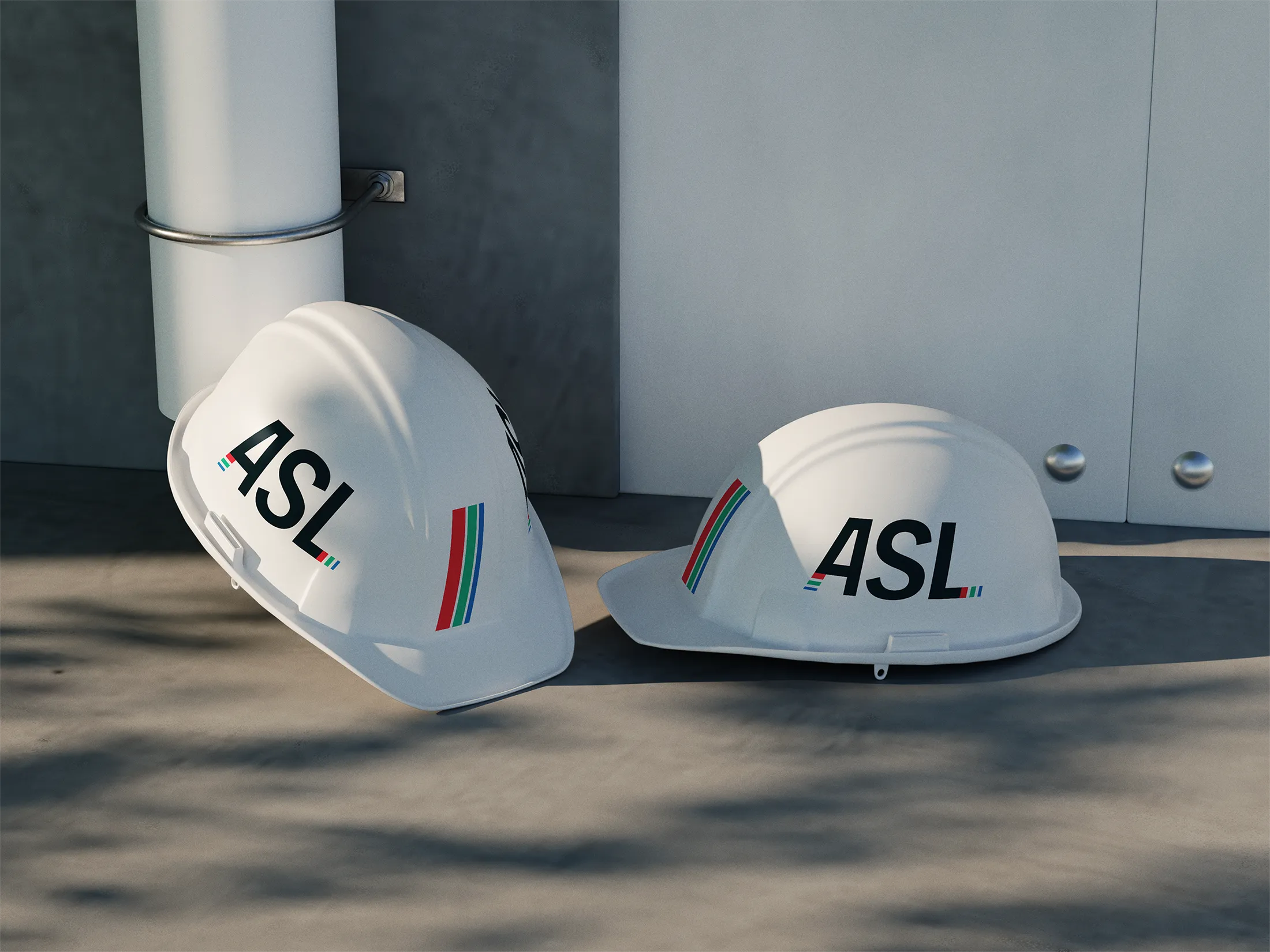
I love finding opportunities to brand things that most people don't think to brand. Safety gear is not a typical canvas, but for a company whose team shows up on job sites every day, a hardhat or high vis vest is prime real estate. When the opportunity is right there, you take it.
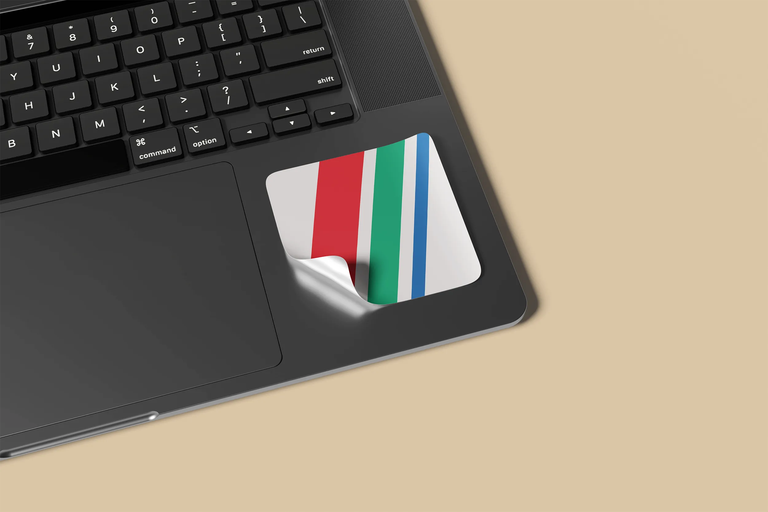
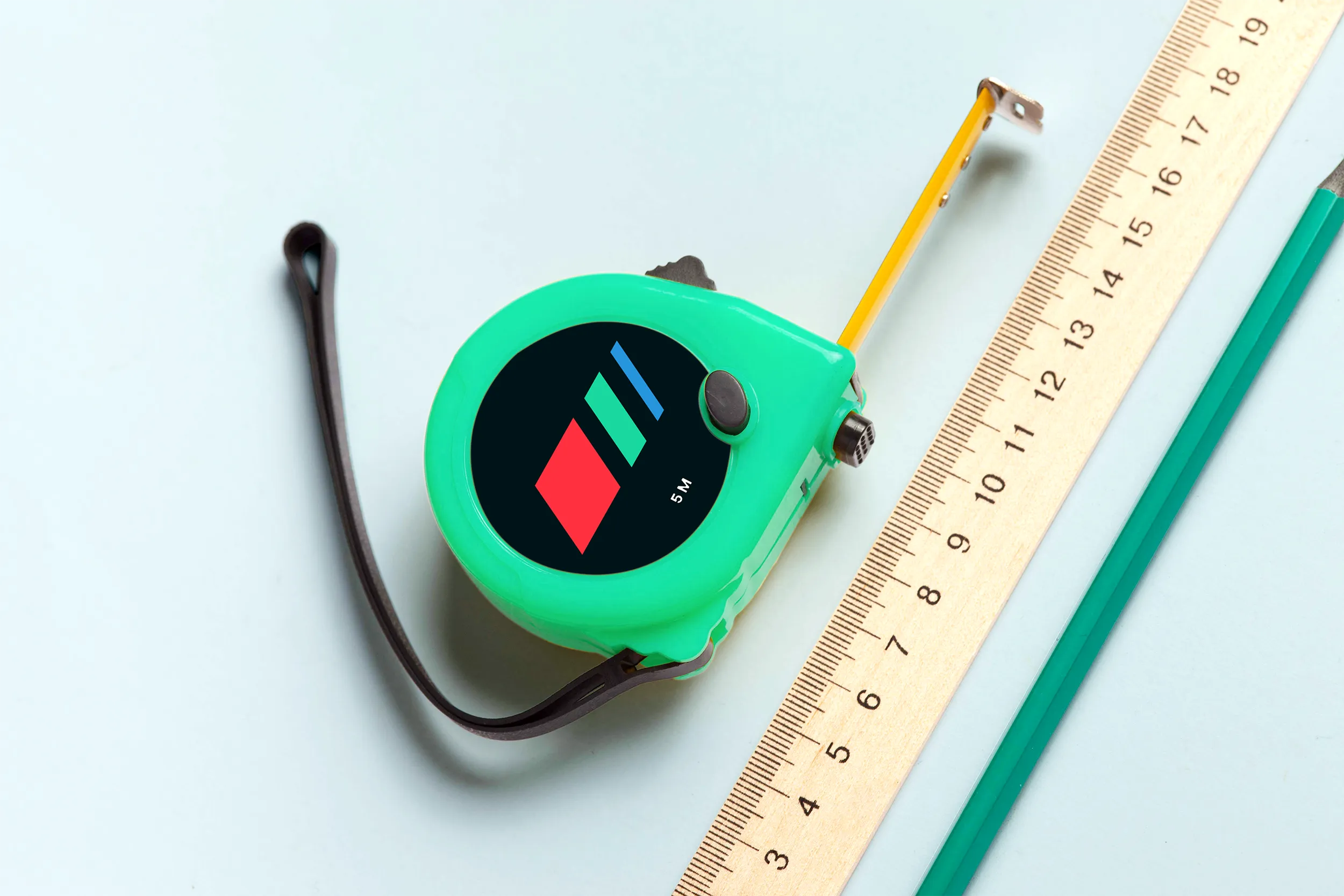
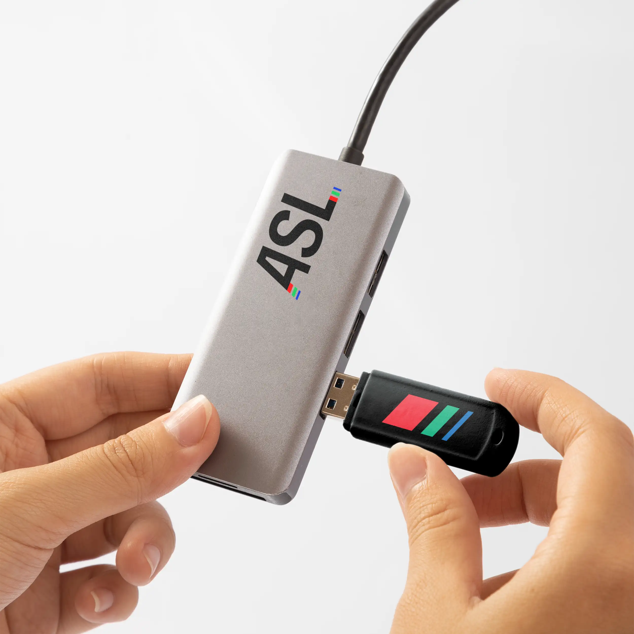
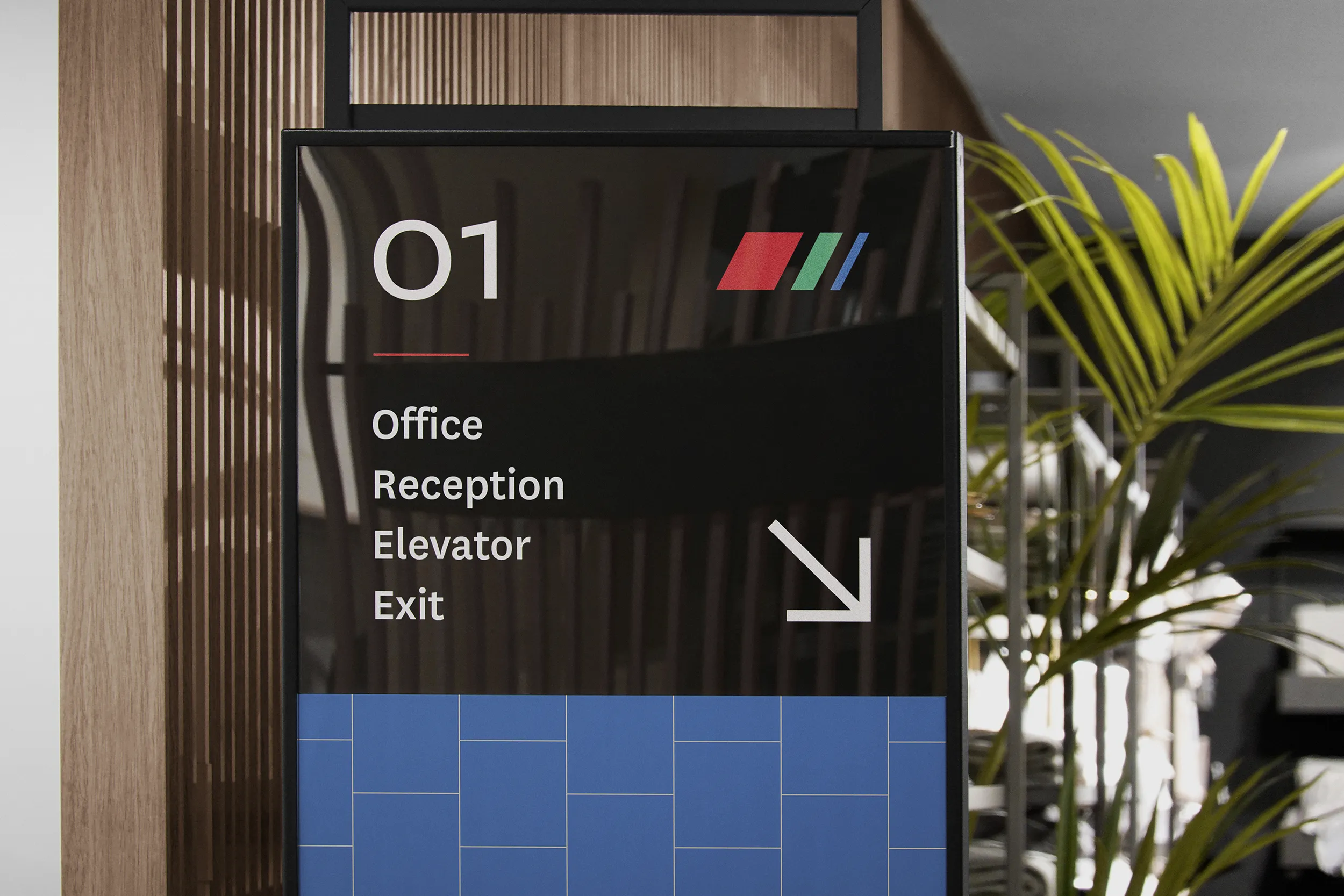
The primary logo keeps the three-colour stripe device that made the original recognisable and sharpens it. The letterforms lean forward with a customised angle that brings precision and momentum in equal measure. Confident at large scale. Solid when space gets tight. A standalone three-stripe submark sits alongside as a secondary signature for the places the full wordmark simply won't fit.
The existing tricolour of blue, red, and green was the right foundation. It just needed more to work with. The refresh refined those three and extended the palette outward, adding neutrals that give layouts room to breathe without softening what makes ASL easy to spot. Bold where it needs to be. Calm where that serves the work better.
The existing typeface was already doing good work. The refresh unlocked more of it. Expanding the range of weights in use created clearer hierarchy across headings, supporting copy, and body text. More variation, more flexibility, nothing new introduced. The system the team already had just got a lot more useful.
A modular square and block system gives the brand a graphic language that genuinely travels. Shapes can be arranged into distinctive layouts, used as masks, or built into compositions that scale from a digital banner to fabricated print. It lands on branded hardware as cleanly as it does on a screen. Alice Tai picked up the system for the website and ran with it beautifully. The brand holds up wherever ASL does.
Colour contrast was checked across the full palette to make sure text stayed readable no matter how the brand was being used. The typeface comes in a wide range of weights, so the team has real flexibility in layouts without ever sacrificing legibility.
Physical applications were a genuine consideration for this project. ASL's team works on-site, which means the brand needed to hold up on safety gear too, including hardhats and high vis vests. Getting contrast and scale right on branded workwear is not an afterthought when your staff are wearing it on a job site every day.
ASL has a brand that carries the full weight of what they do. It holds onto what made the original recognisable and builds on it, giving the team the range to show up consistently whether they are presenting to a stadium, a hospital, or a transport authority. Assets cover everything from digital platforms to fabricated physical media. The brand works wherever ASL works.
A good brand shouldn't put a ceiling on what you offer. If your business has grown beyond what your identity currently says about you, let's build something that tells the whole story and holds up everywhere you need it.