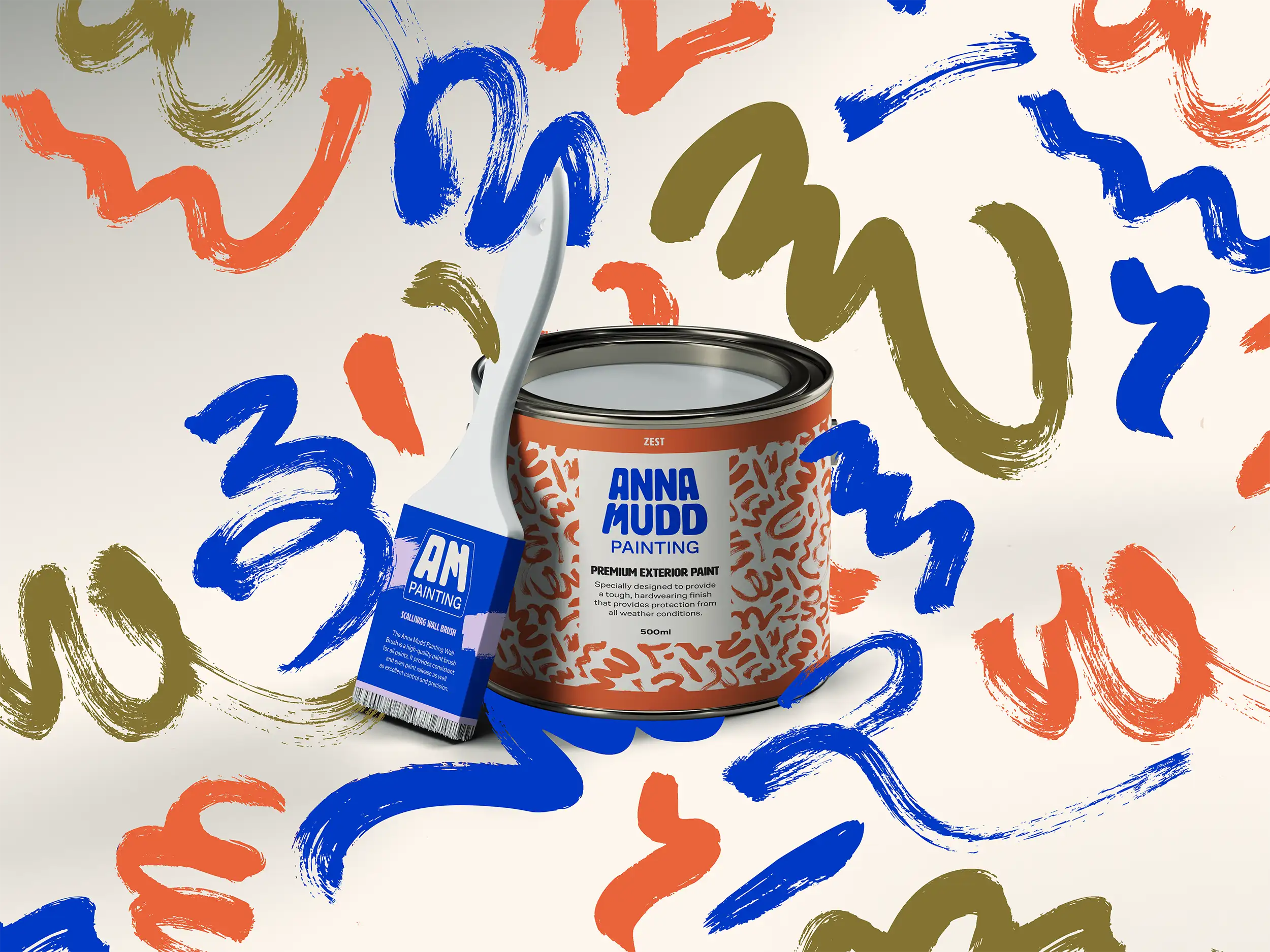
A brand identity for a female-founded painting company built to stand out in a male-dominated industry.
Anna Mudd Painting is a residential and commercial painting business based in Missouri founded by Anna Mudd. She came to the project as a starting business with a few clients, no existing identity, plenty of personality, and a clear idea of the colours she loved. The brief was to build something bold, distinctive, and unmistakably hers.
What needed to be built:
These goals shaped every design decision, from the logo concept to the colour pairings.
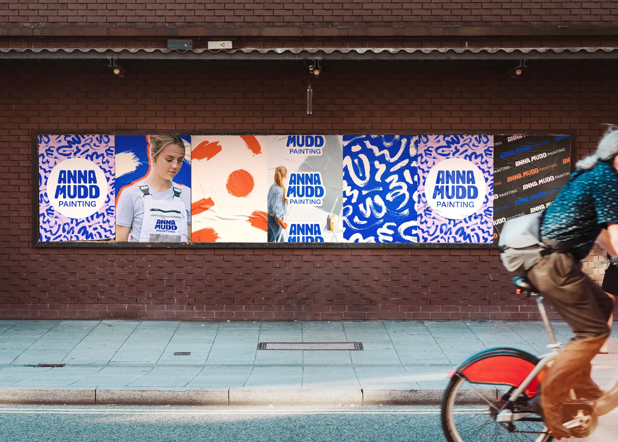
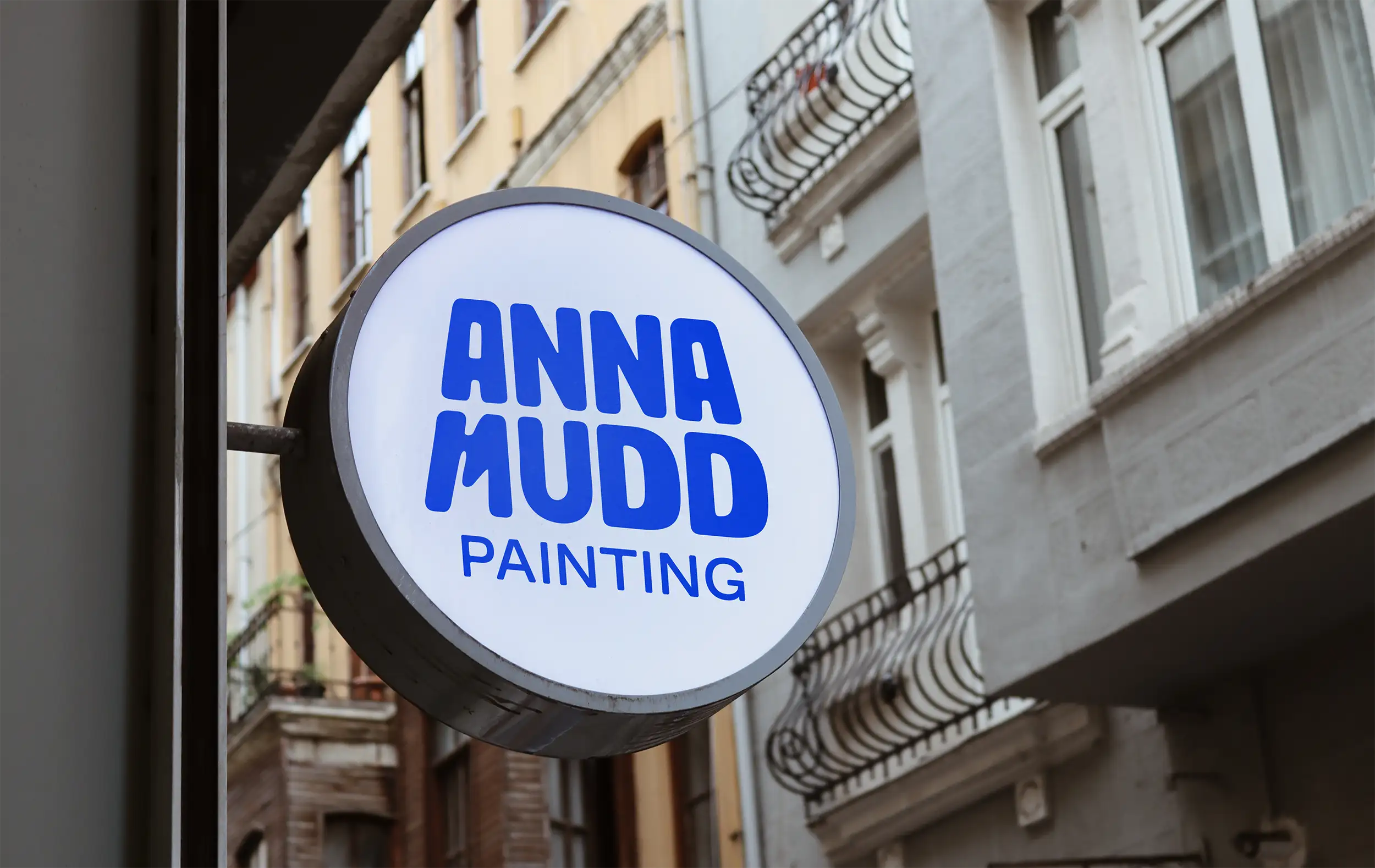
This was my first branding project after leaving full-time employment, and my first international client. Both of those facts still feel significant. Anna is a fellow creative, and working with someone who already has strong visual instincts and knows what she likes was a bunch of fun. She still sends me photos of other painters' branding with a note that hers is better. She is right.
Colour contrast was considered throughout the brand development. The brand guidelines include approved colour combinations and usage guidance to ensure contrast ratios are met across print and digital applications. This is standard across all of my projects.
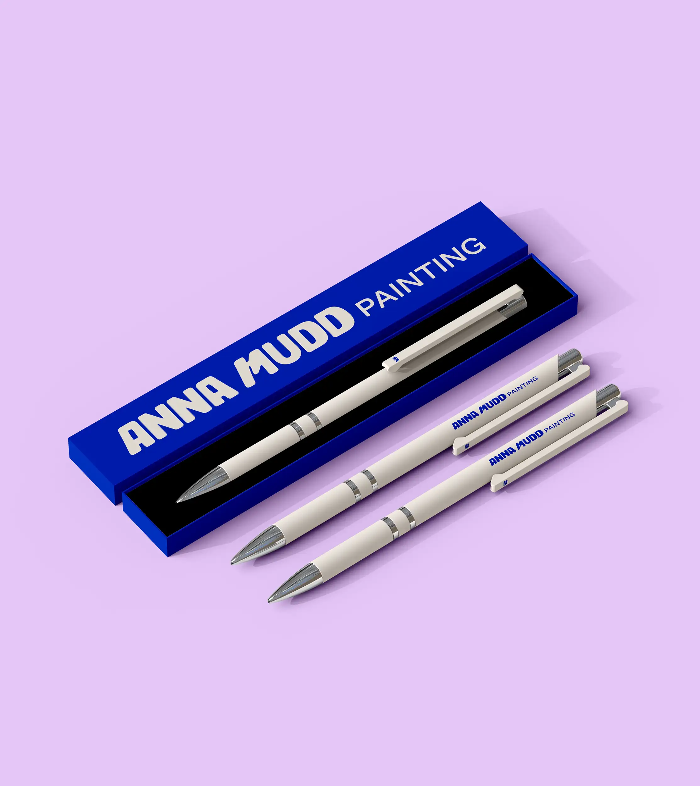
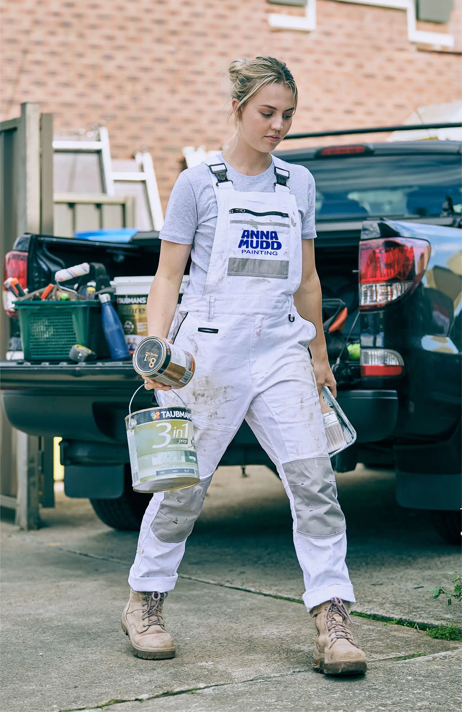
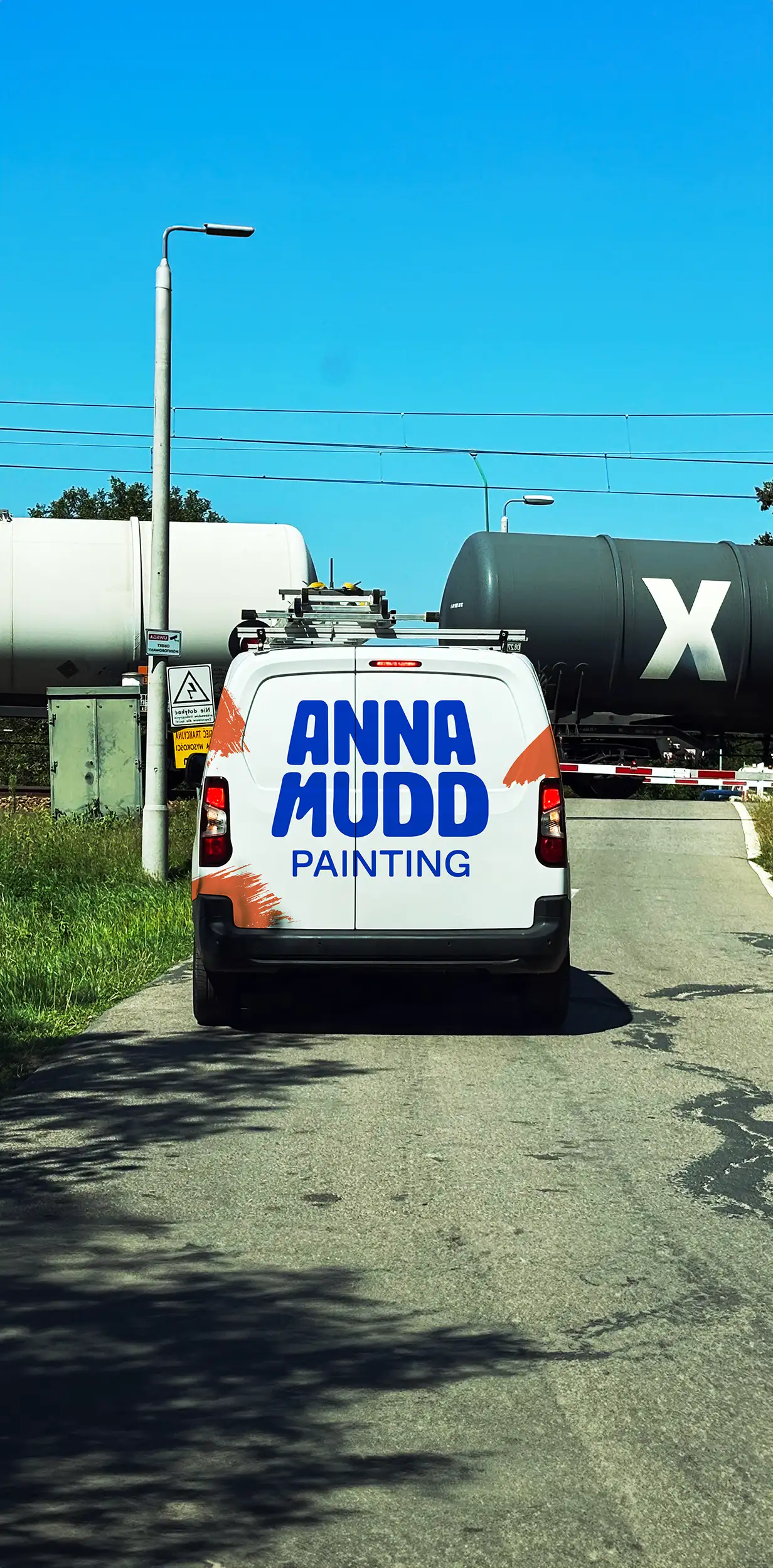
Anna's brand gave her something to build on fast. The boldness of the palette and the confidence of the identity carved out a clear niche, and her commitment to considerate, friendly painting practices gave it real substance. She built a successful business in California, and when she relocated to St. Louis, the brand moved with her and kept working. It has continued to grow her presence and reputation in Missouri, and Anna still uses it everywhere with the kind of ease that reassures this direction was the right one.
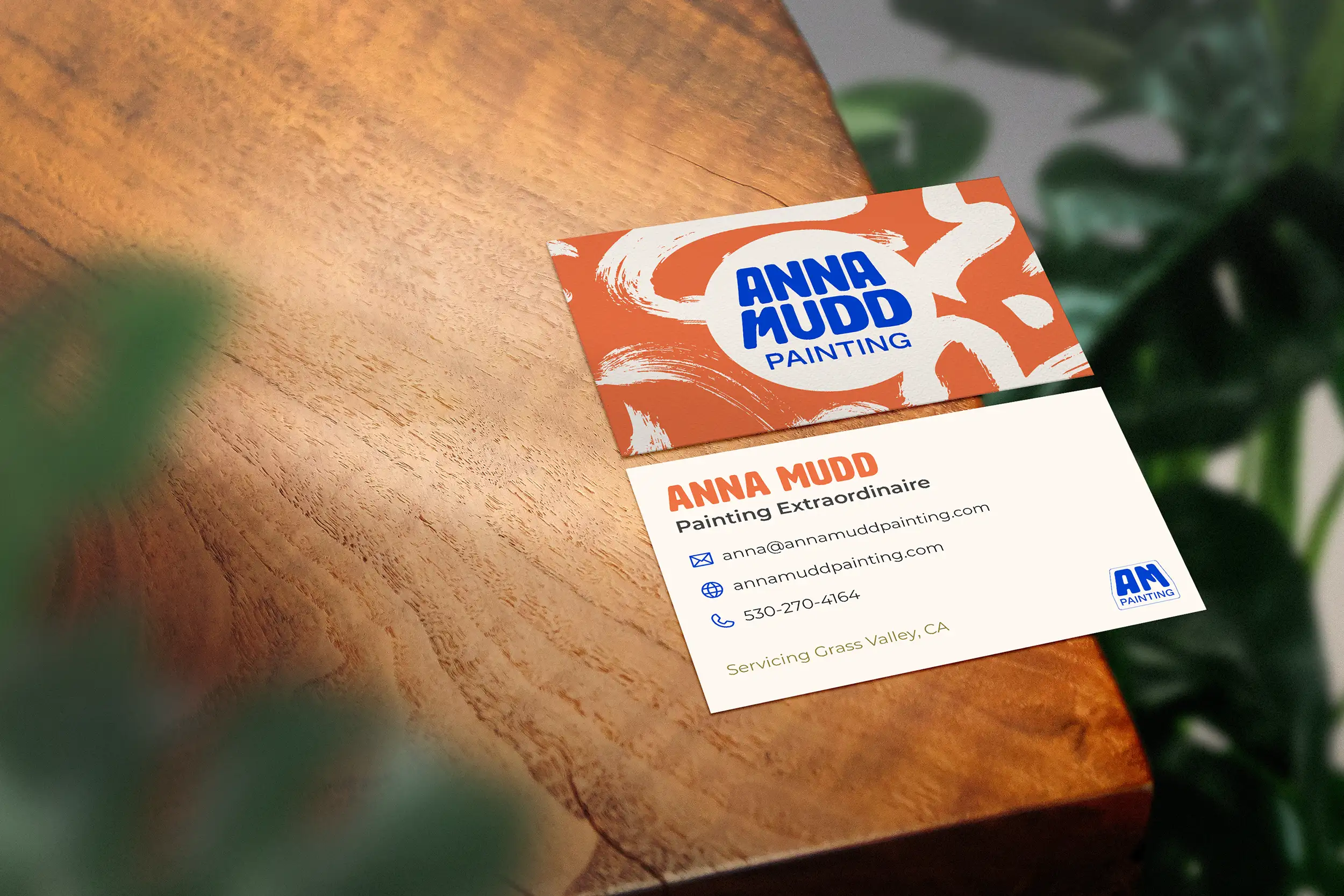
Standing out in a crowded industry starts with a brand that looks and feels like you. Whether you are starting from scratch or ready for something new, together we can build an identity that earns attention and holds it.
